Tender Project Overview
Project Context:
This project originated as part of CareerFoundry’s User Experience Design program. The project requested the design of a digital wallet application with key features, including the following:
A form of security to authenticate a transaction
A feature allowing users to send/save/move money
A budgeting or goal-setting feature
Problem Statement and Objective:
Tender’s users need a way to budget, transfer, and manage their money because it is hard to keep their financial information organized in one place and stay on top of what is happening with their finances.
My Role:
Completed all deliverables, including user research, wireframes, and prototypes
Methodologies/Deliverables:
Competitive Analysis
User Interviews
Surveys
Affinity Map
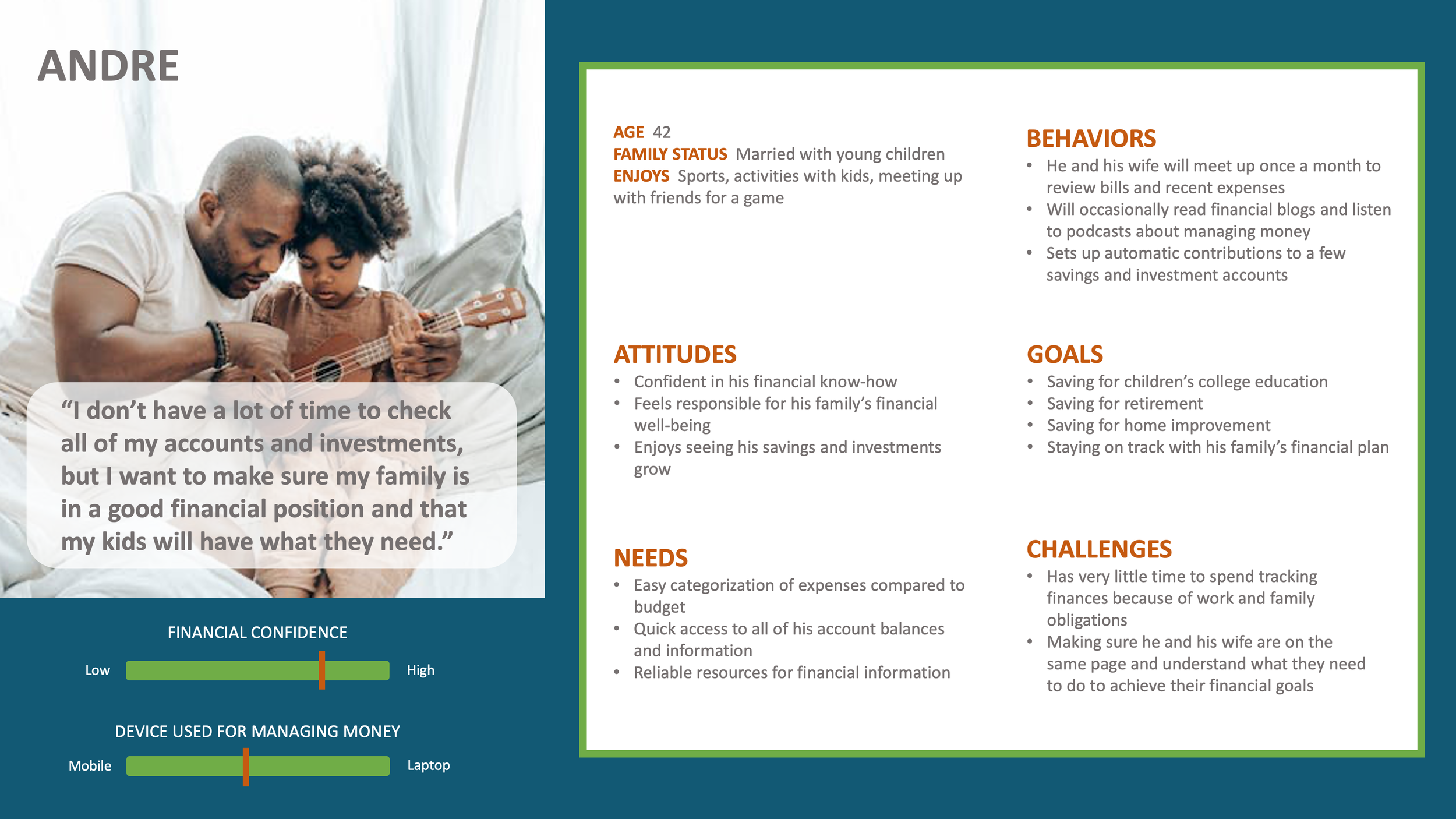
Personas
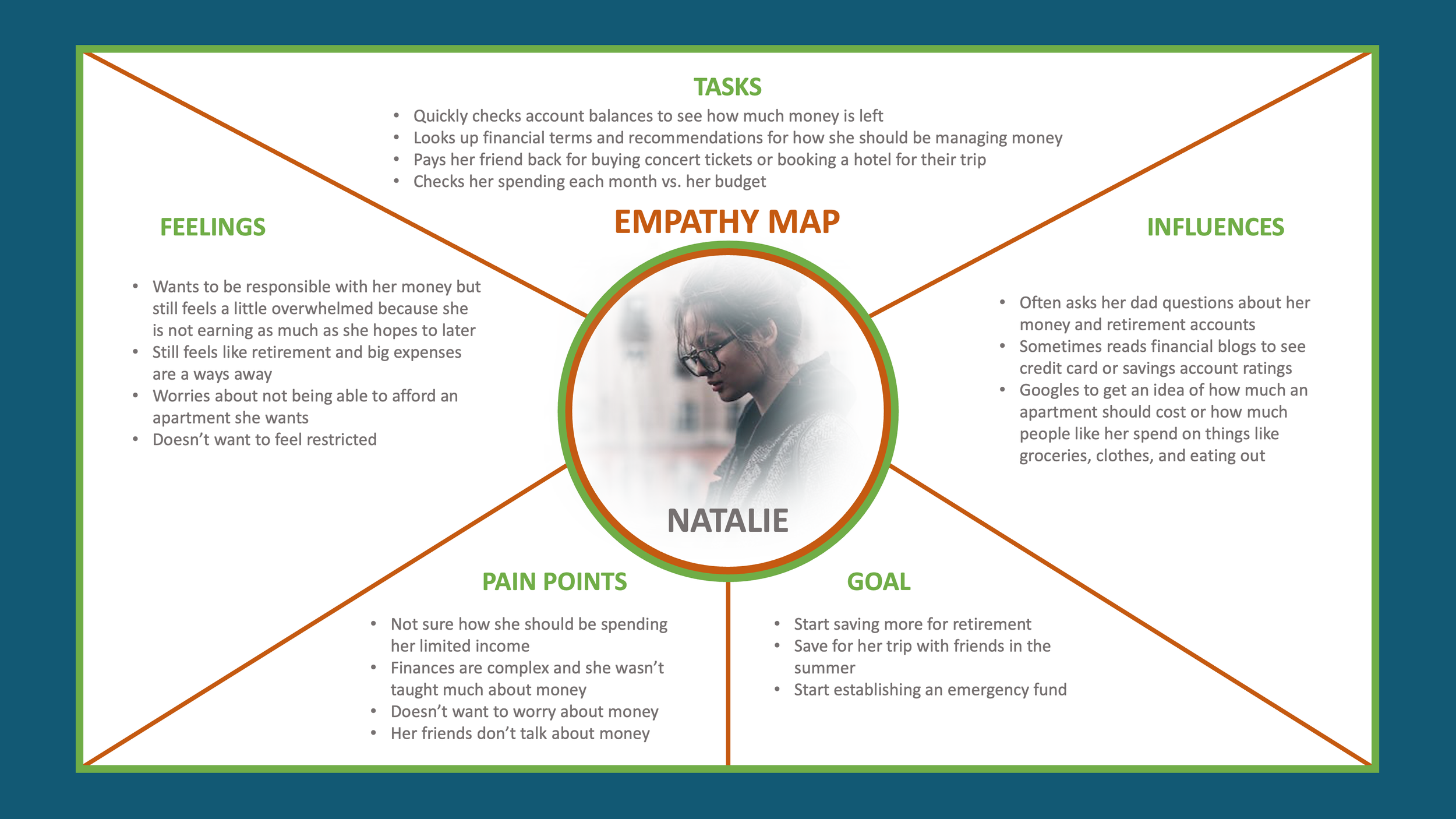
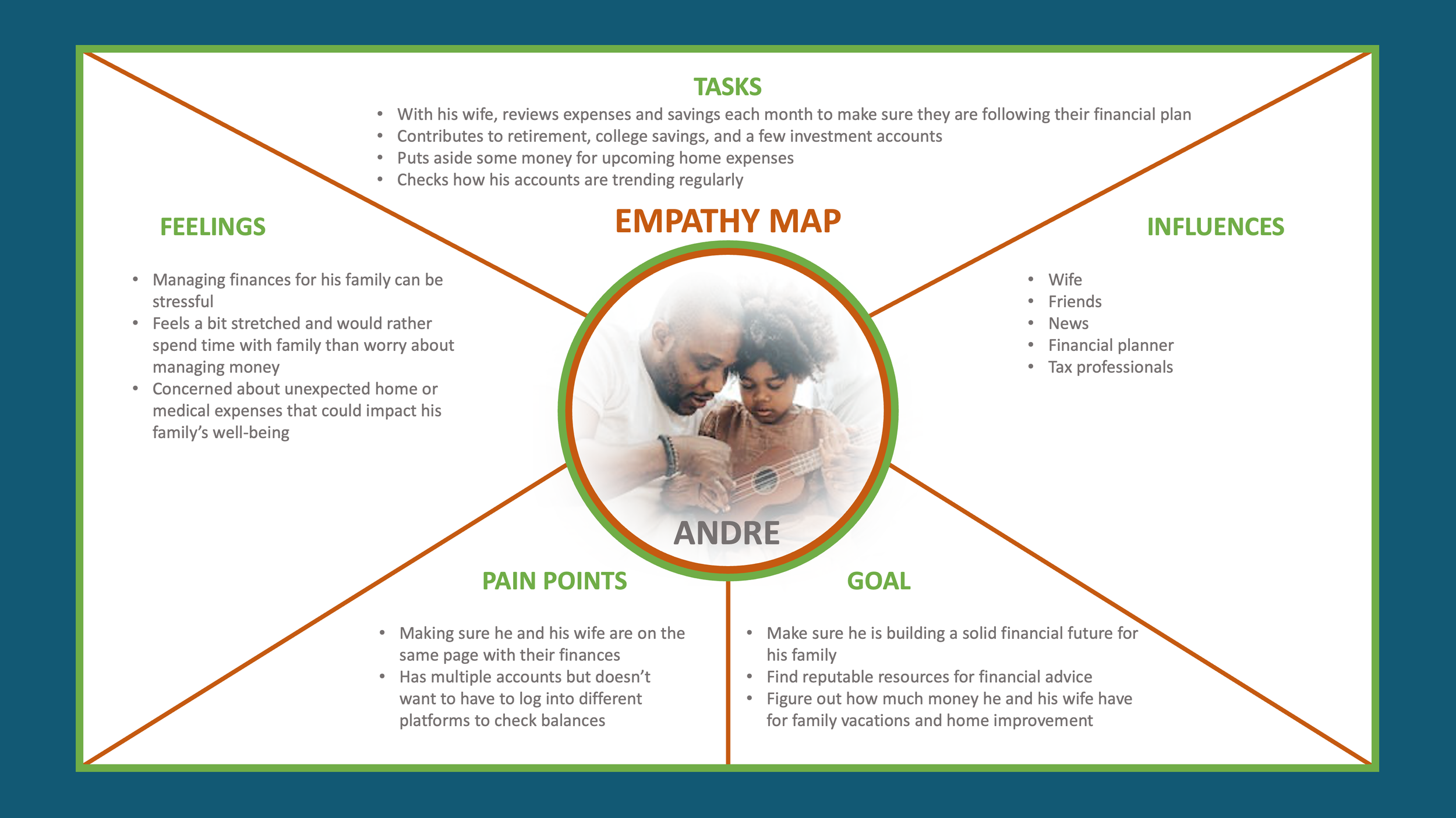
Empathy Map
User Stories
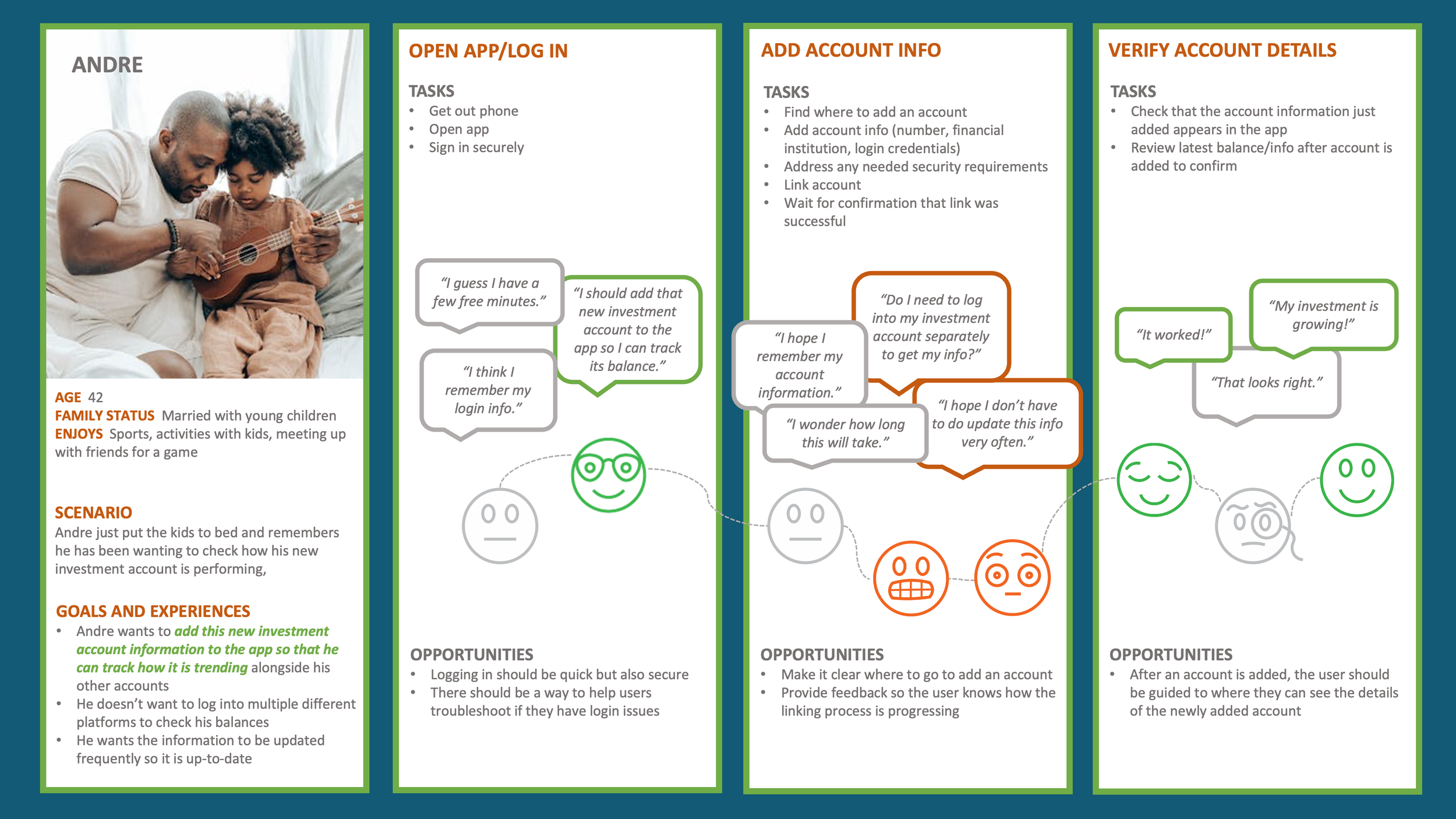
User Journey Maps
User Flows
Card Sorting
Site Map
Usability Tests (Test Plan, Test Script, Test Report)
Preference Tests
Wireframes and Prototypes
Style Guide
Tools:
Figma
Sketch
Optimal Sort
UsabilityHub
Google Forms and Google Calendar
Adobe Illustrator and Photoshop
Zoom
Paper, pen, whiteboard, marker, sticky notes
Few Competitors Combine Money Management Capabilities

Tender’s Unique Value Proposition:
Offer easy transfer capability ALONG with engaging money management tools
Key Takeaways
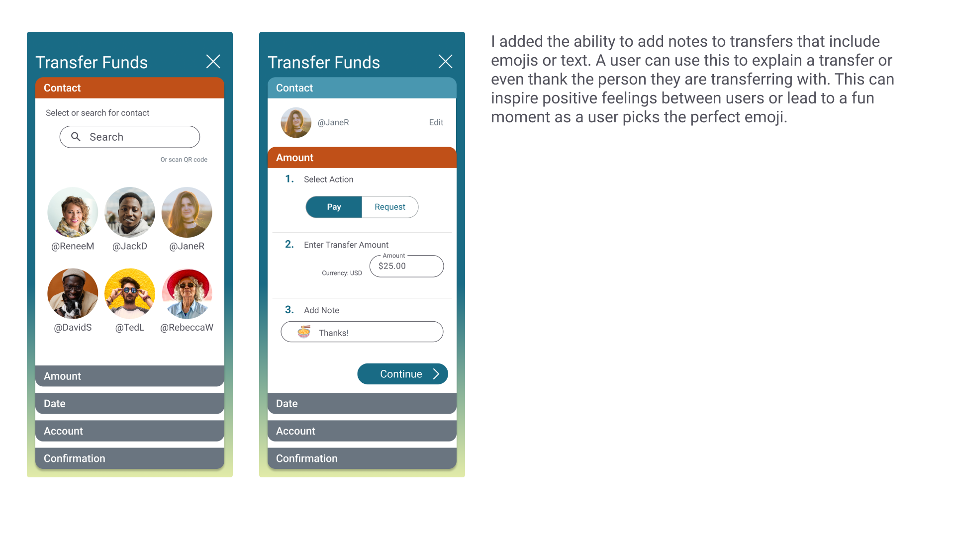
Offer an opportunity for some personalization/engagement, like adding notes describing a transfer
Combine transfer capabilities with thorough money management tools
Potentially add more flexibility to transfer process by adding ability to schedule a transfer
What Users Experience

Key Research Insights
Pain Points
Having to log into multiple sites/apps to review finances despite is not ideal when people lead busy lives, so having one place for users to see information about various accounts could be helpful.
Survey participants indicated unexpected expenses (64%) and spending more than they probably should (57%) were the biggest challenges to managing their finances. Perhaps users would benefit from encouragement to develop an emergency fund, information about planning for unexpected costs, and a feature alerting them when their spending is more than expected.
Current Tools
79% of survey participants transfer money between friends and family via apps, so this functionality is used fairly widely.
Only 64% of survey participants agreed that current tools used for managing and transferring money worked well for them, so people could be open to using other tools.
Budgeting
Interview participants had similar spending categories for budgeting, so offering common spending categories as part of a budget-setting process could be helpful, including the following:
Housing
Groceries / Dining Out
Transportation
Utilities
Travel
Most interview participants say they track expenses to some degree, but at least two indicated that this was more important when they were younger, less financially stable, or in a temporary circumstance that required them to pay closer attention to spending. Different life stages and circumstances will impact the needs of users and how they would use the application.
Three interview participants used spreadsheets to manage their finances, despite some noting they are hard to maintain. One benefit of spreadsheets is flexibility with budget categorization, as users may want to look at their spending habits in unique ways. Providing custom categorization in the app could provide a similar benefit.
Savings
Offering a way for users to track progress toward their savings goals could be useful, as 93% of survey participants had a savings goal, with the following being the most commonly selected goals:
Emergencies (57%)
Vacation (57%)
Retirement (50%)
House (43%)
Emotions/Feelings
Participants have concerns about security and sharing their information, as four participants mentioned security while discussing financial management tools.
Money is a sensitive topic, so offering encouragement and options to control displays of information or customize reminders could help the user experience. The app should avoid making users feel discouraged about their financial position.
Women in particular may feel they need resources or may be less confident regarding money.
Developing Personas
Based on the feedback from interviews and surveys, I began to define two personas that represent distinct characteristics of potential target users. These personas are at different life stages and have different financial confidence levels and goals.
While Natalie might be less confident with her finances and primarily concerned with budgeting, overspending, and basic financial tips, Andre is a bit more financially stable but is concerned about time. He is looking for convenient and quick financial management tools and is excited to see progress toward financial goals.
Detailing the User Journey
For my personas, I created user journey maps to define the process and context of target users utilizing key functionality in the application. This key functionality was the result of my user research and outlined in the project brief.
Writing User Stories
With key functional requirements and personas identified, I drafted initial user and job stories to support proposed key features.
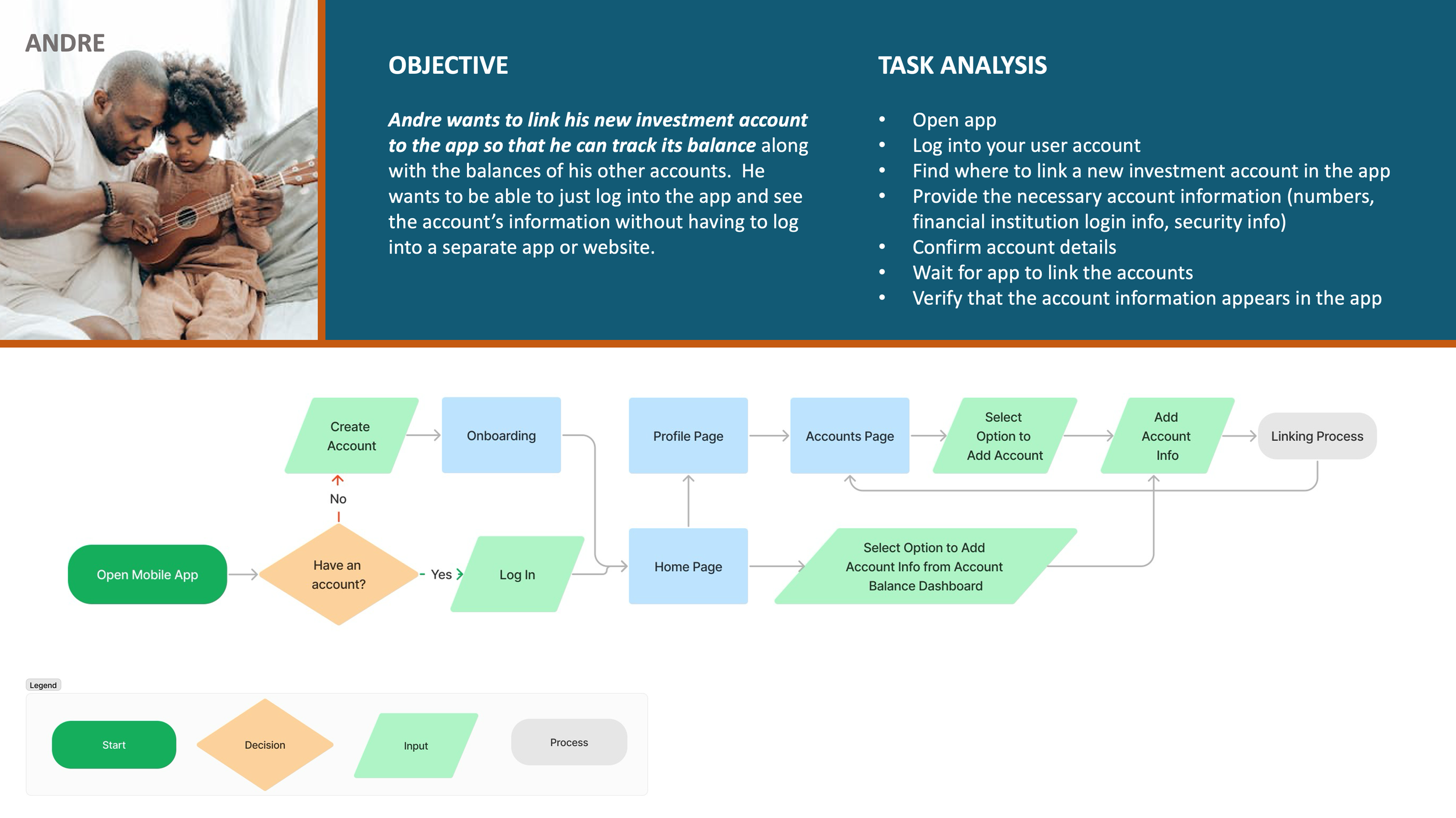
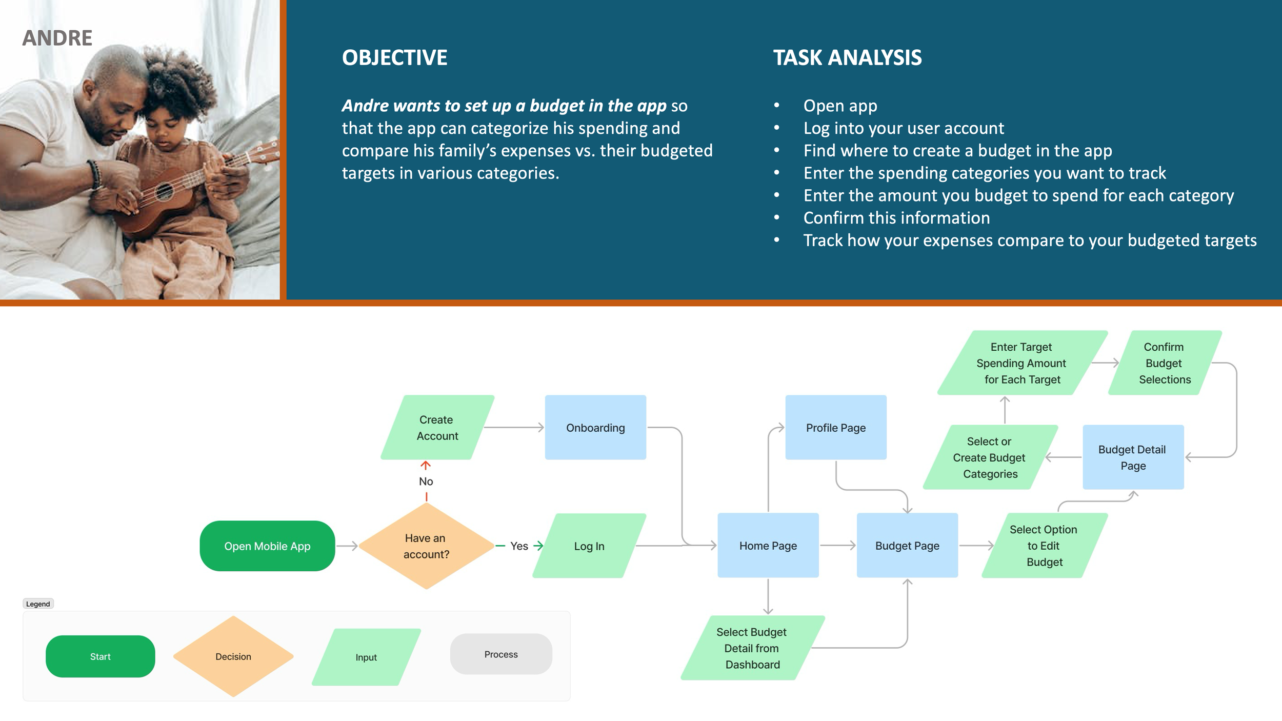
Diagramming User Flows
The next step involved translating user journey maps into initial user flows for key functionality, asking the following questions:
What steps in the process need to be included?
How can I allow users to accomplish the task efficiently?
How does this flow compare to the competition?
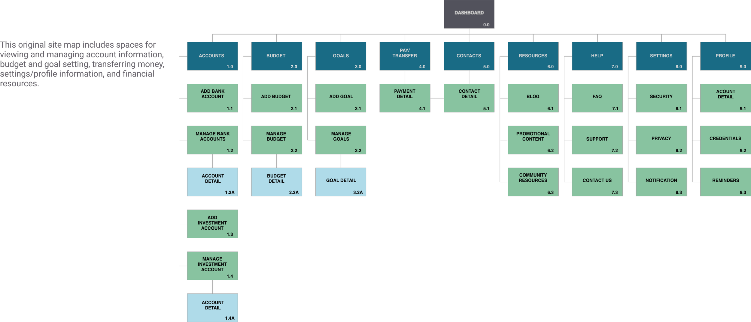
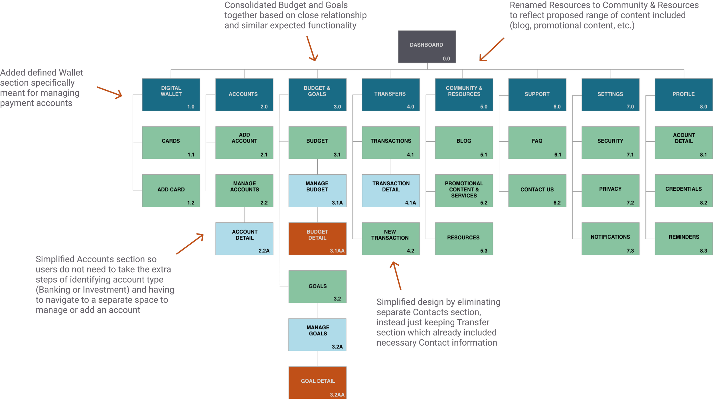
Updating the Site Map
Once user flows for key functionality were defined, I established an initial site map and then completed a card sorting exercise to verify the information architecture for the app.
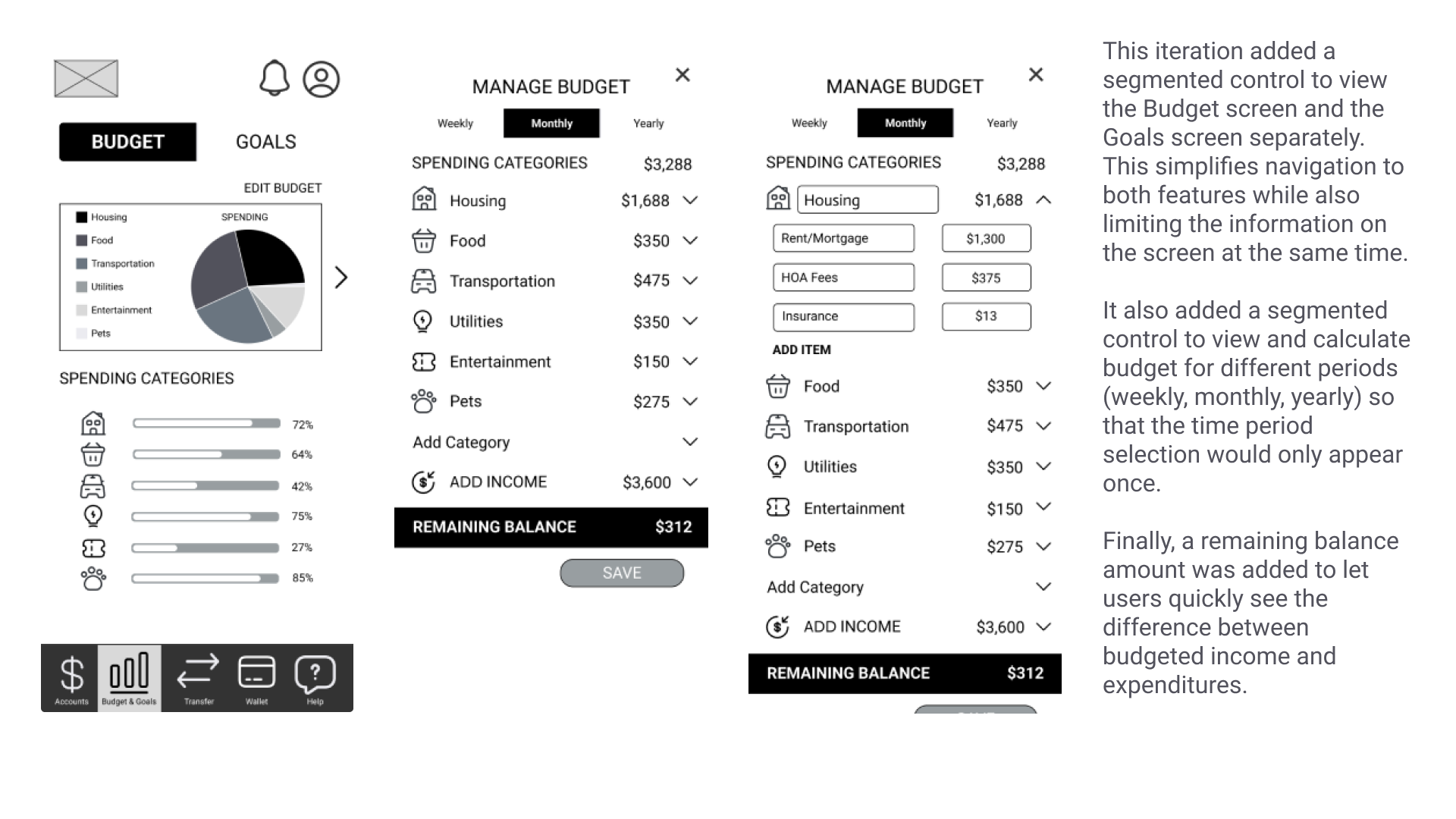
Based on user feedback, I found opportunities for improvement: 1) renaming sections for clarity, 2) consolidating similar functionality into one section, and 3) simplifying flows.
Sketching and Prototyping
Testing the Prototype
Overview
After completing a mid-fidelity prototype, I conducted usability tests to
Observe and measure how successfully users complete the primary functions of the application
Evaluate the efficiency of user flows
Evaluate the interest in using applications like this
Gain feedback on general impressions and usability to make improvements, generate ideas for future functionality, and identify areas of confusion or concern
Research Methods
6 participants recruited from personal network
Participants had similar characteristics to personas (life stage, marital status)
Tests conducted in person and remotely
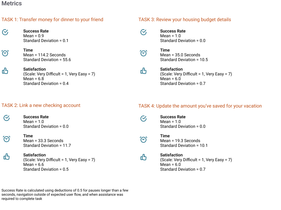
Analysis included calculating a success rate and creating an affinity map
Test also included post-test survey (Single Ease Question with a 7-point scale for each task)
Usability Test Insights
Iterating on the Design
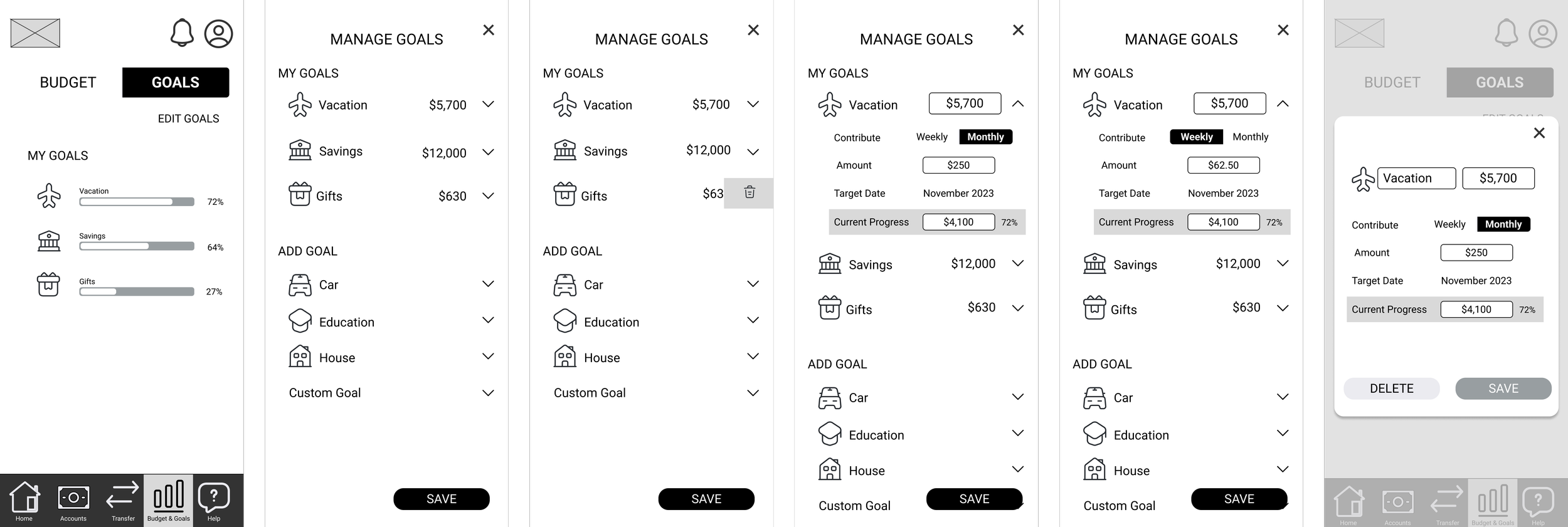
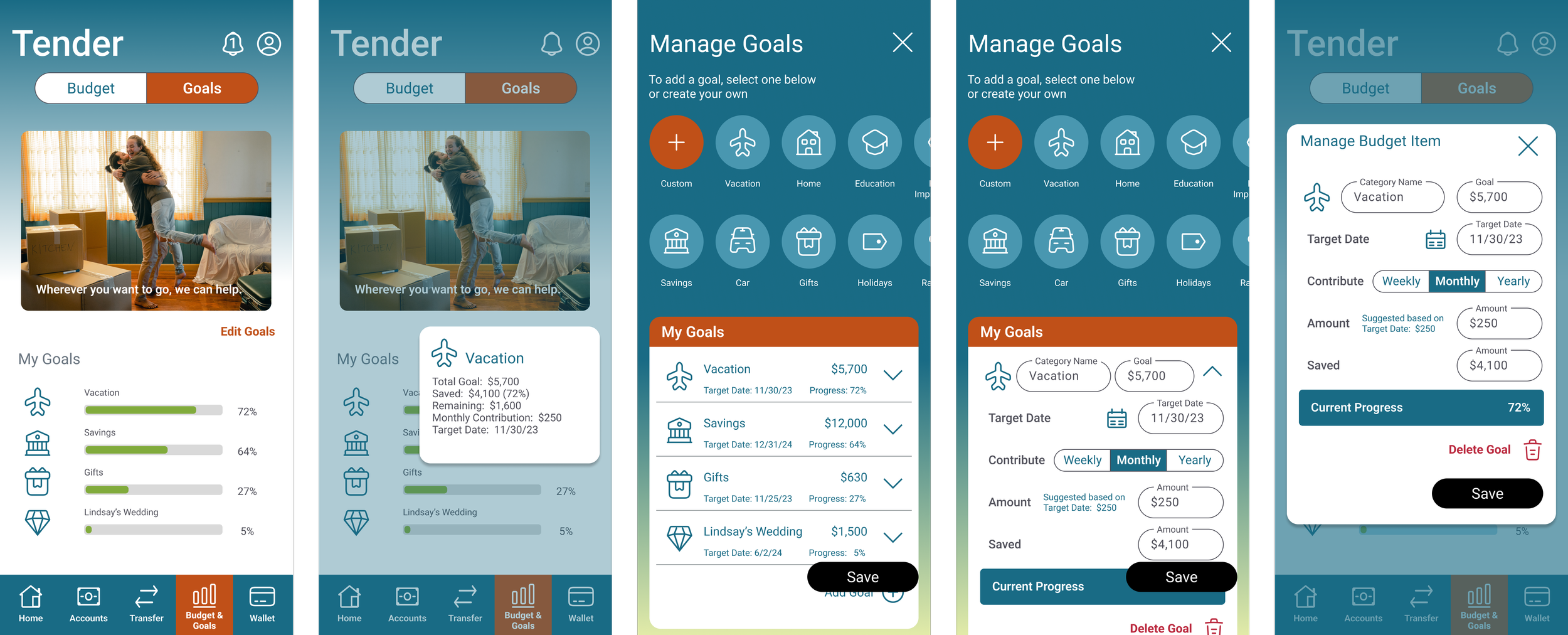
Based on an issue identified during the usability tests (Issue 1: Several users had a tendency to click on budget and goal category icons to edit), I added new functionality to the prototype. On the Budget and Goals screens, a new option allows an editing window to appear when a user taps on an icon, increasing efficiency. Previously, users would have to select the “Edit Budget” and “Edit Goals” options to begin editing.

Increasing Fidelity
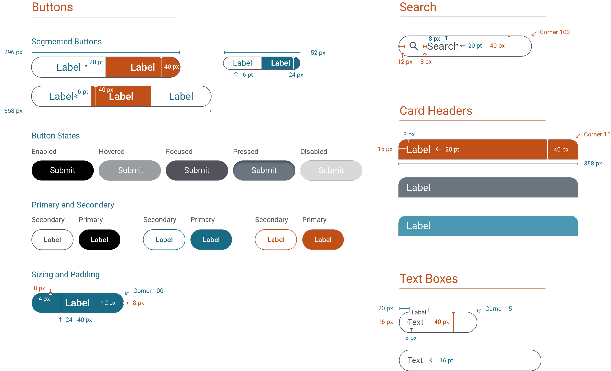
Initial high-fidelity prototypes used lighter green and gray colors, which needed more contrast when used as background for light text to meet WCAG accessibility guidelines.
Feedback also indicated some confusion based on the colors used for the progress bars on the main Budget screen. Peer feedback also suggested moving the important budget balance information near the top of the Manage Budget screen.
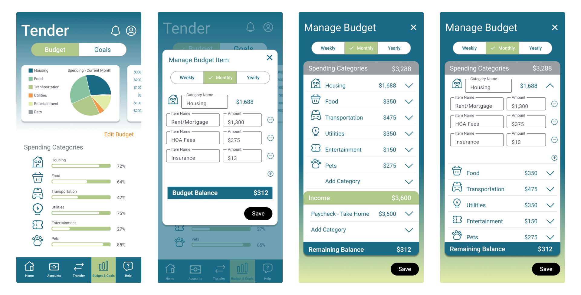
Updated High-Fidelity Prototype
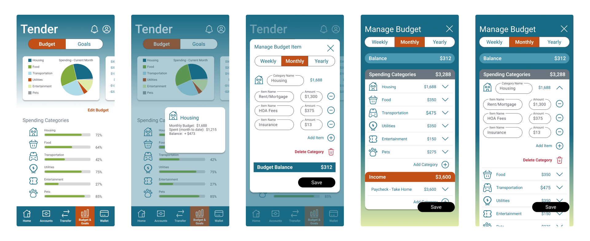
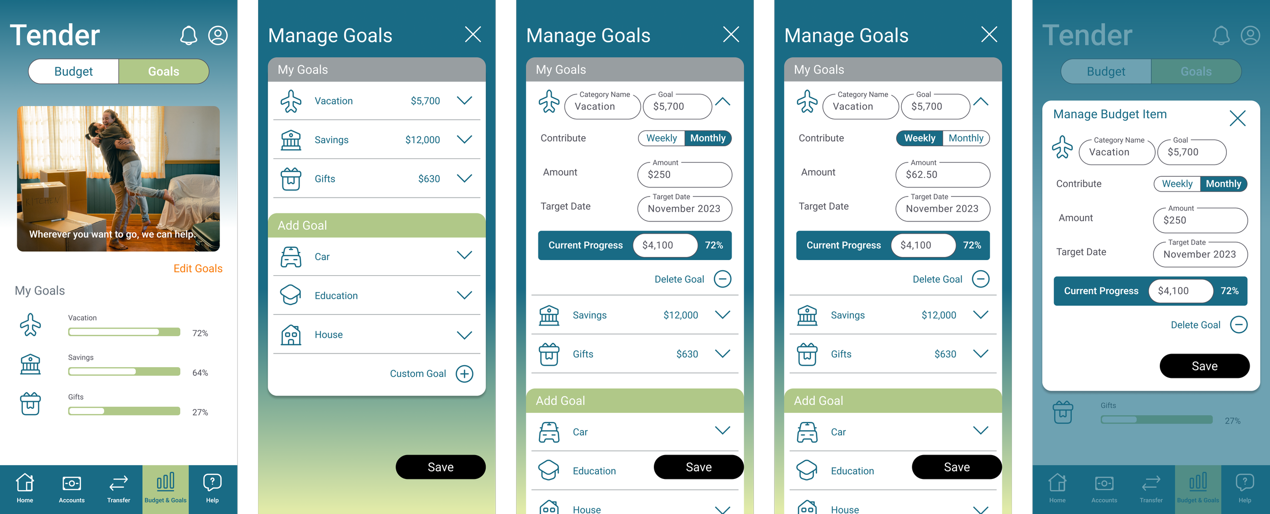
The updated high-fidelity prototype has new colors to ensure contrast meets accessibility standards. This included updating the colors of the segmented buttons, navigation bar, card headers, and some text. I also updated the colors of the progress bars to make them more clearly indicate progress based on user feedback. In addition, I added an interaction to the progress bar where users could press on a bar to see more detailed information about the spending category.
Other changes included updating the location of the balance information on the Manage Budget screen to a more prominent position at the top and adding additional functionality to delete spending categories.
How the Transfer Process Evolved
How the Goal-Setting Process Evolved
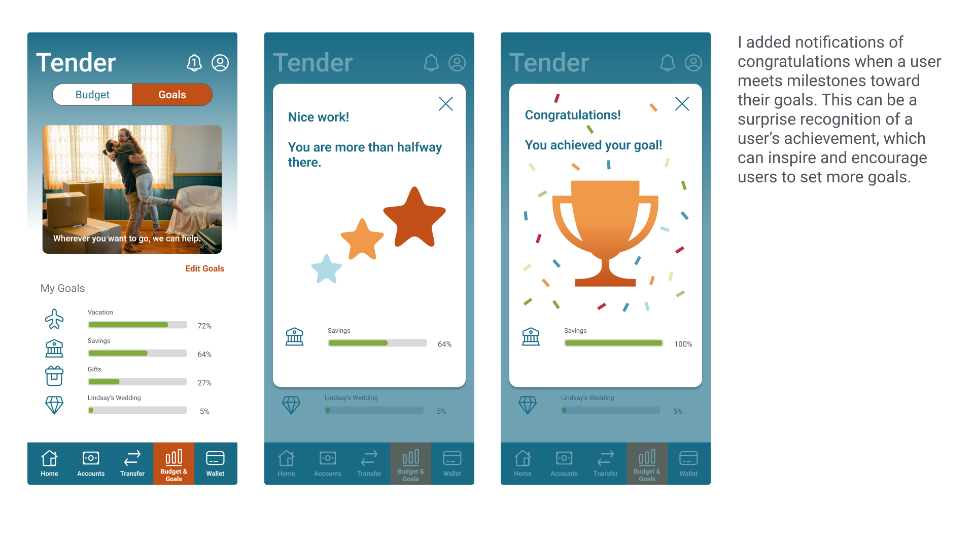
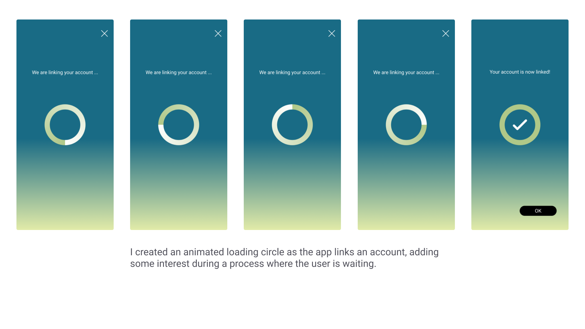
Designing for Engagement
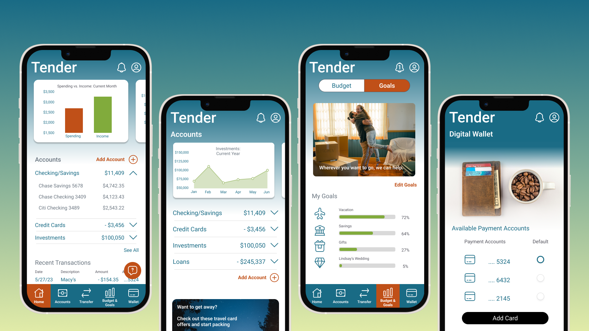
As I continued to refine the high-fidelity prototype, I sought to include engaging features for users with the goal of creating positive emotions and encouraging continued use of the application
The Prototype
Style Guide
Language and Voice
Language
Language should be professional but accessible and easy to understand (a high school student should be able to understand)
Avoid unexplained financial jargon or acronyms
Tone of Voice
Inviting
Friendly and encouraging
Sensitive to people’s fears about money
Should not make people feel bad/fearful about their financial position or goals
Dos and Don’ts
Do encourage and inspire
Don’t forget people have their own goals and financial situations, and it’s not our place to judge or promote a particular lifestyle
Don’t avoid humor
Do stay professional
Typography

I chose a sans serif font to have a simple, clean, and modern look. This type of font works well for both text and numbers.
I did not want the font to distract or create additional visual clutter, because some screens will include quite a bit of information and utilize the typography in various ways (headings, instructions, chart labels, etc.).
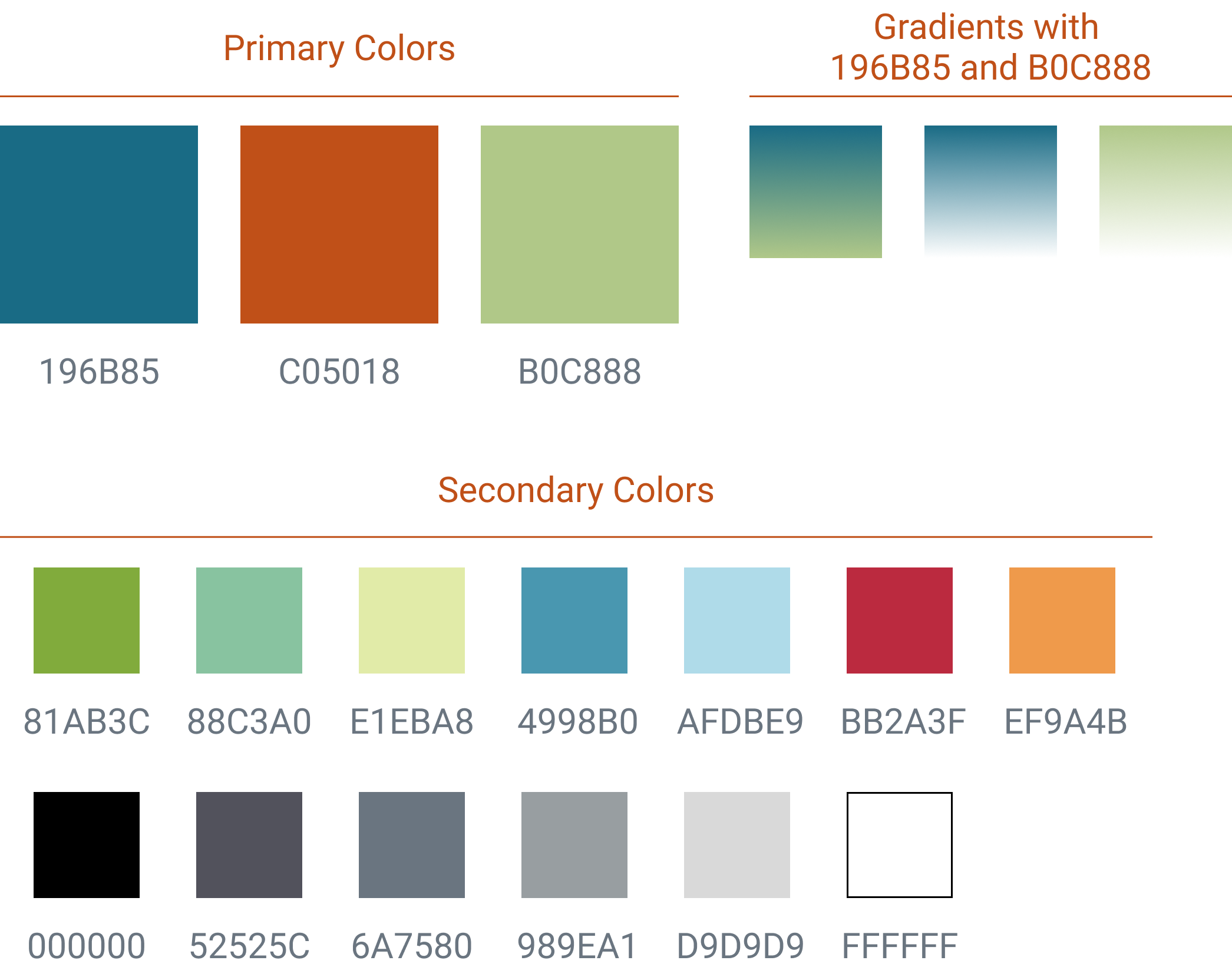
After testing color contrast, I also included suggested text and background color combinations.
Color
Primary colors of blue and green are meant to invoke trust, stability, and money (fitting for a financial application).
Orange is meant to be warm, uplifting and rejuvenating.
Grey and black are primarily meant for text and other elements to stand out against light backgrounds.
Other UI Elements
Iconography
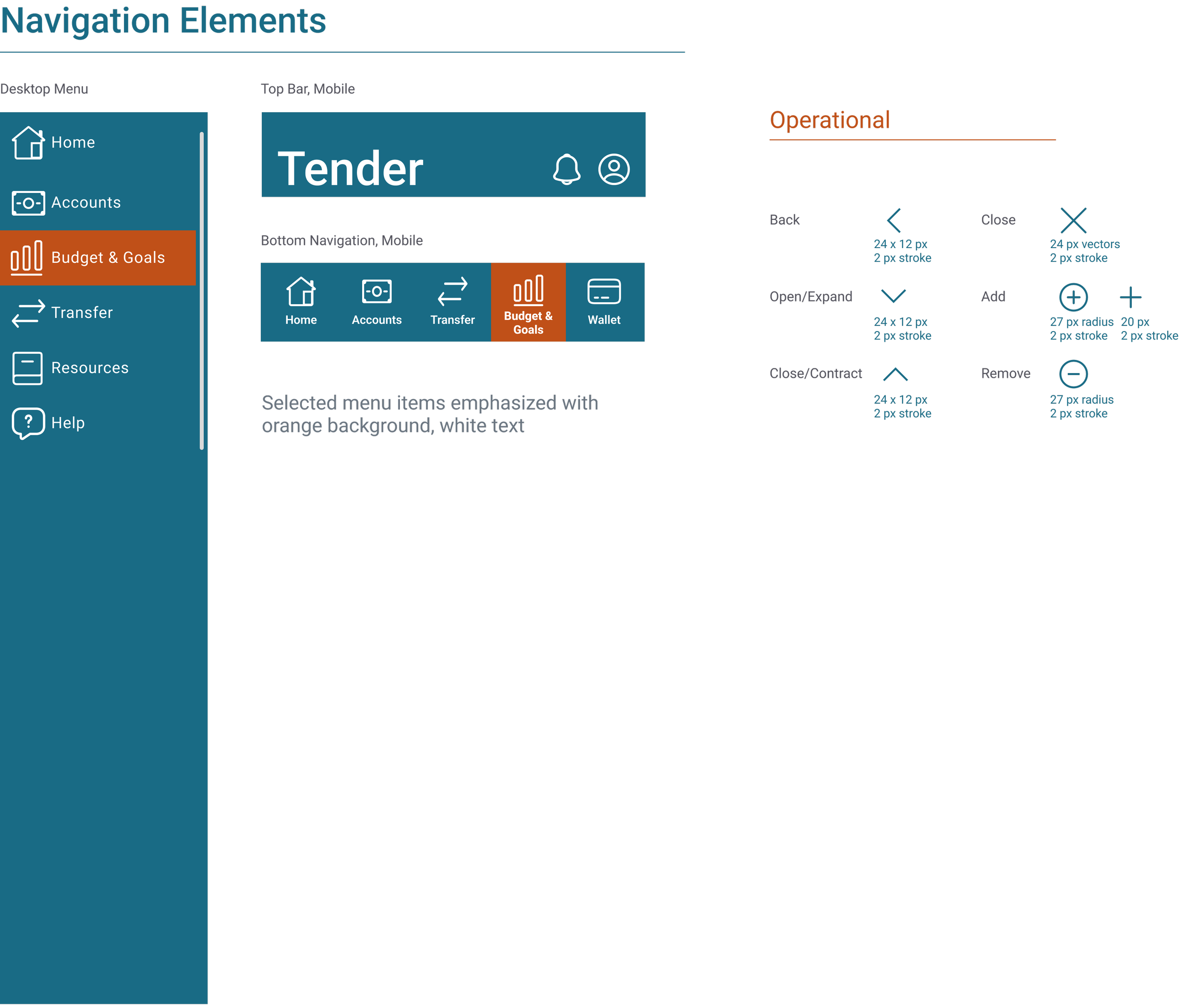
Icons selected are primarily teal or white in color. Emphasized or warning icons are in orange or red.
Stroke should be about 2 px, and icons generally fall within a square of 30-36 px. Minimum/maximum width and height between 24 and 36 px on mobile.
Imagery
Tender’s imagery should be relatable rather than aspirational. Rather than suggest a user’s goals should be luxurious purchases or exotic vacations, we want the user to feel inspired yet be the driver of what they want their own future to be. People in our images are enjoying themselves but a bit distant, leaving space for users to imagine their own goals. Similarly, our imagery can be at a close point of view (whether it is of an object or hands taking action) so that users can relate and place themselves at the center of their own journey. Imagery should be either neutral lights and darks or contain blues, greens, and warm golds/oranges to align with the color palette.

Retrospective
Key Learnings
Pay attention to cognitive load and visual clutter by utilizing tools like segmented controls and show/hide functionality
Provide the user feedback (task completion, navigation signals, progress updates) to keep users informed
Leave plenty of time to recruit research participants that are in a good position to provide feedback relevant to your target users
Test color contrast early to ensure design meets accessibility guidelines
Usability testing leads to vital improvements and ideas
Challenges
Since this project was for a class, there was not as much opportunity for discussion with colleagues or flexibility with process/brief requirements as there might be with other projects
Ensuring people were comfortable talking about a sensitive topic like their finances
Ensuring enough time was allotted for recruiting and scheduling research participants as well as related administrative tasks for testing
Developing expertise with tools like Figma, Adobe Illustrator and Photoshop
Making adjustments to account for color contrast after project had already gone through a few iterations
Future Steps
Potential further steps include the following:
Build desktop prototype
Prototype additional content
Resources (for desktop)
Help/Support
Test updated navigation
Add additional functionality
Reminders
Custom categorization of transactions into spending categories
Bill and subscription tracking
Ways to collaborate with a partner or roommate

