Propertyfolio Project Overview
Overview
This project was part of CareerFoundry’s UX Design program. A project brief was provided, describing the Persona and feature requirements, including the following:
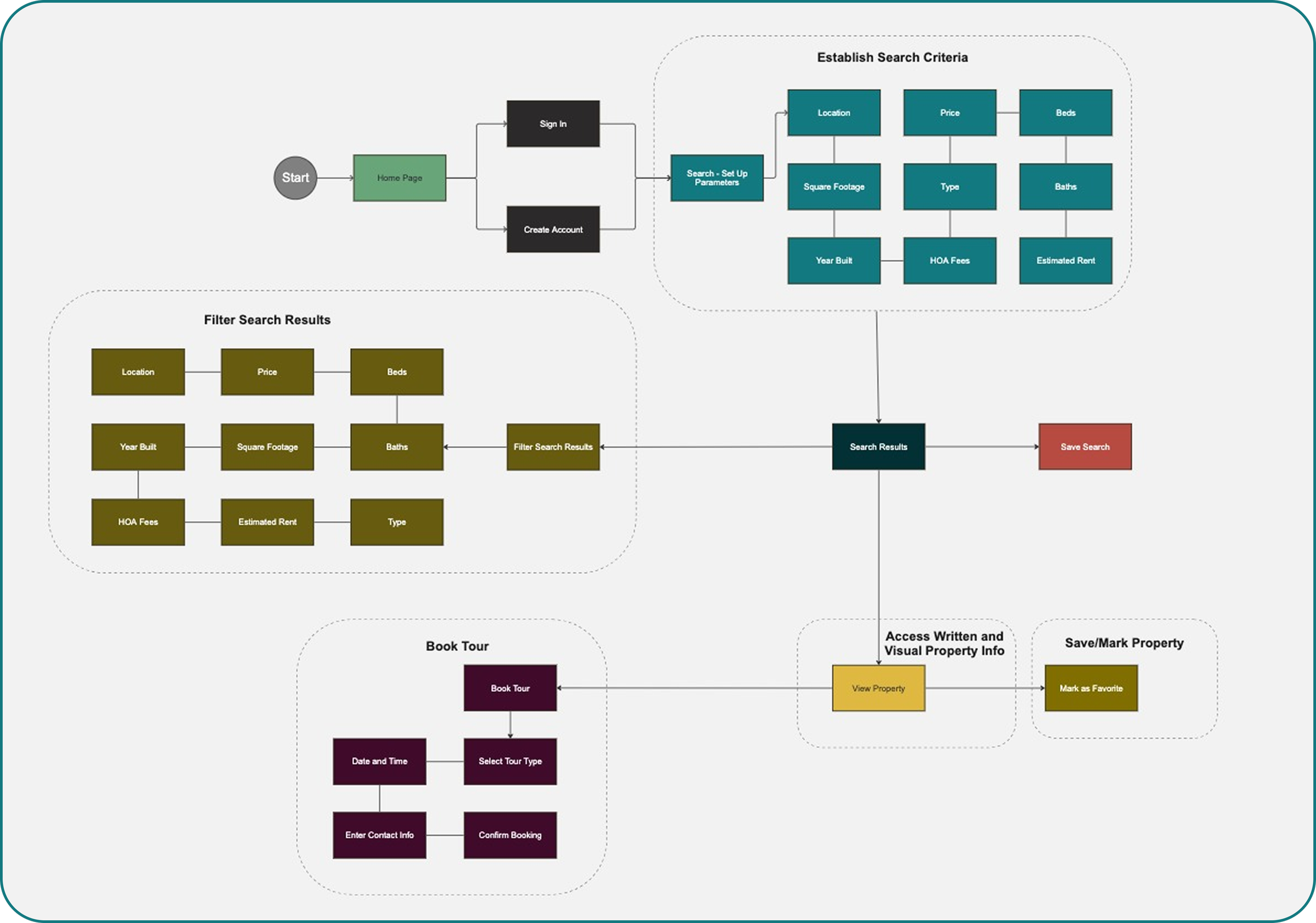
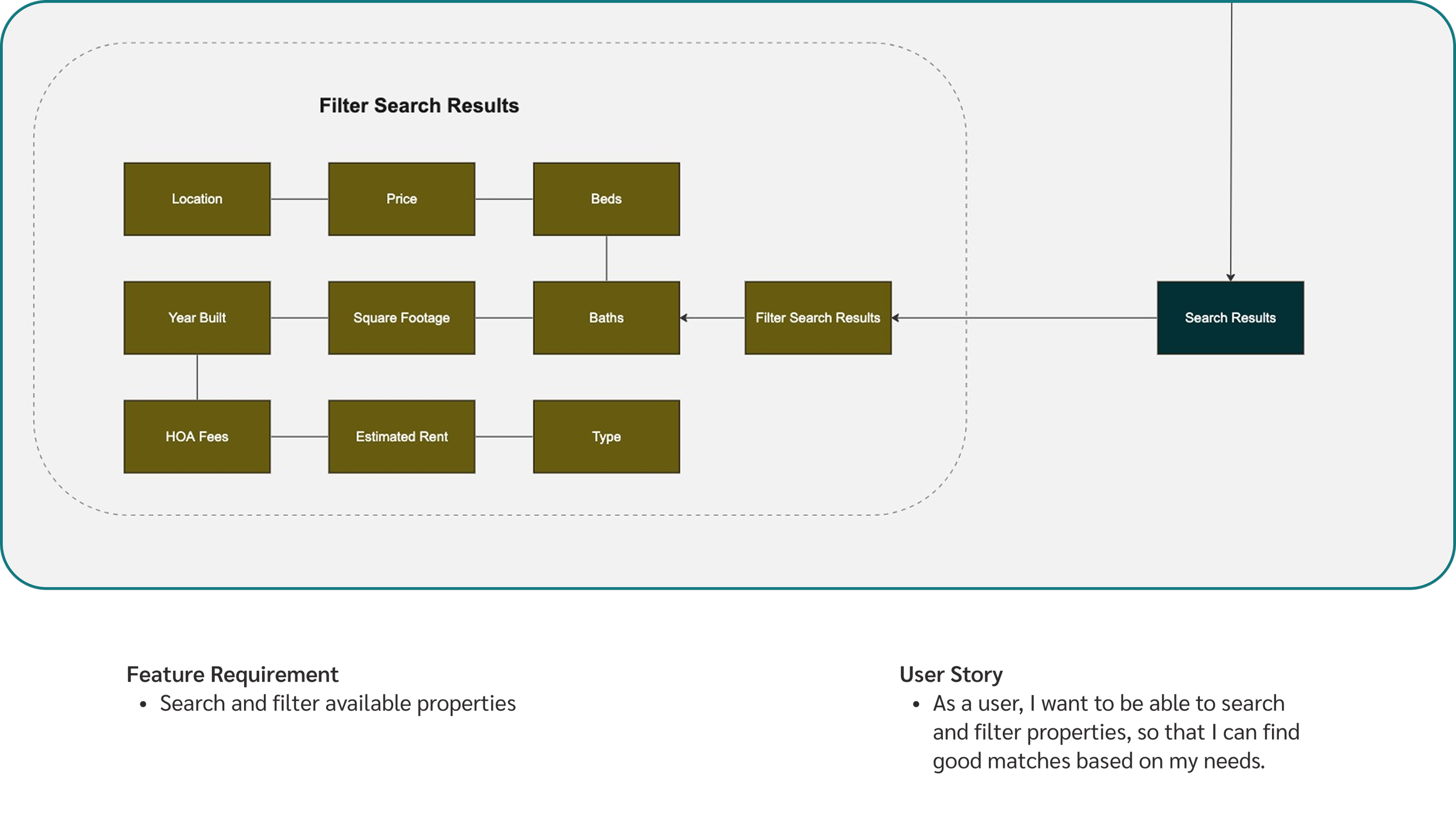
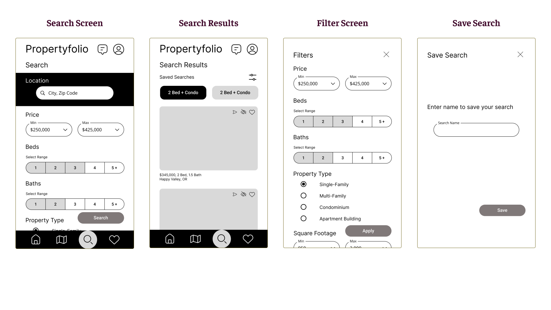
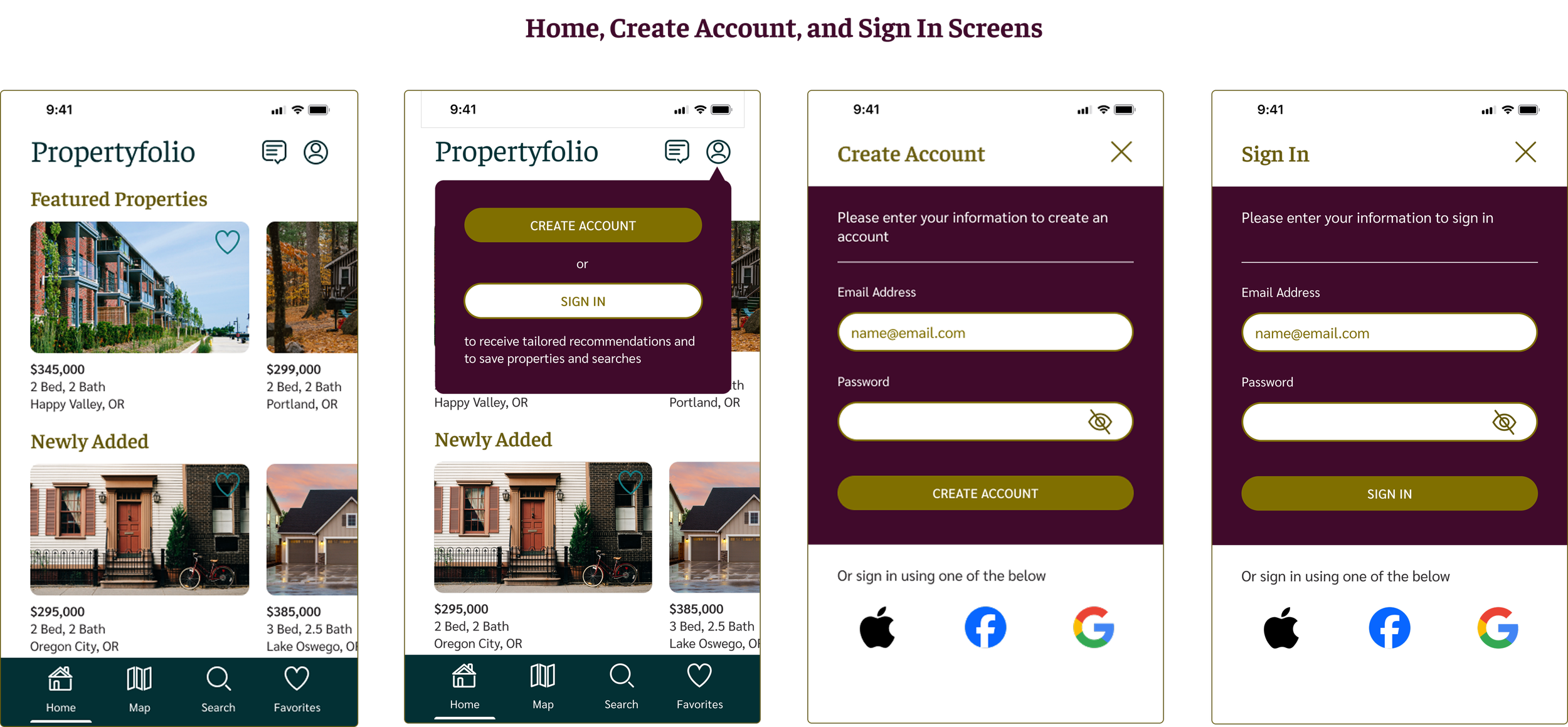
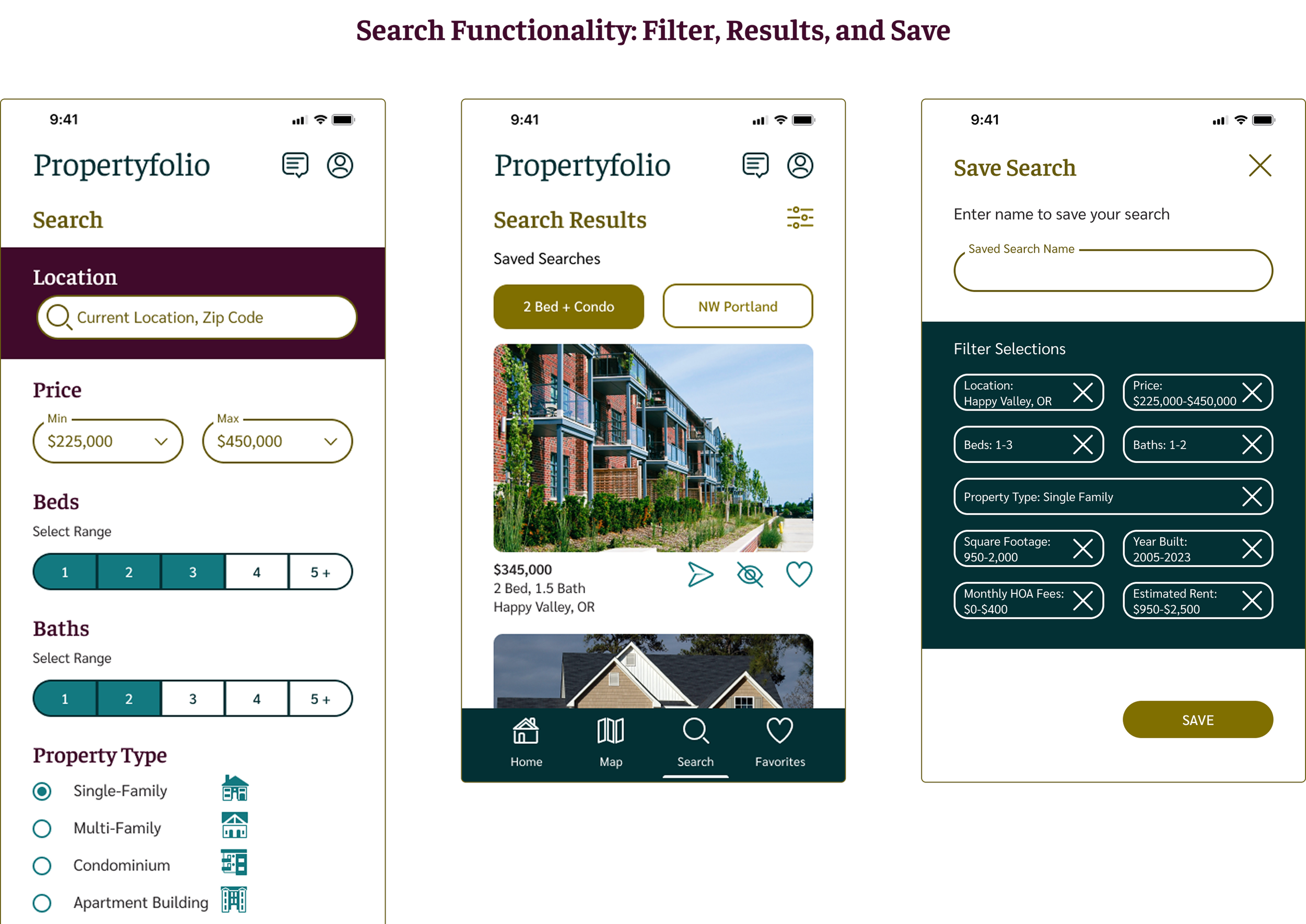
Search and filter available properties
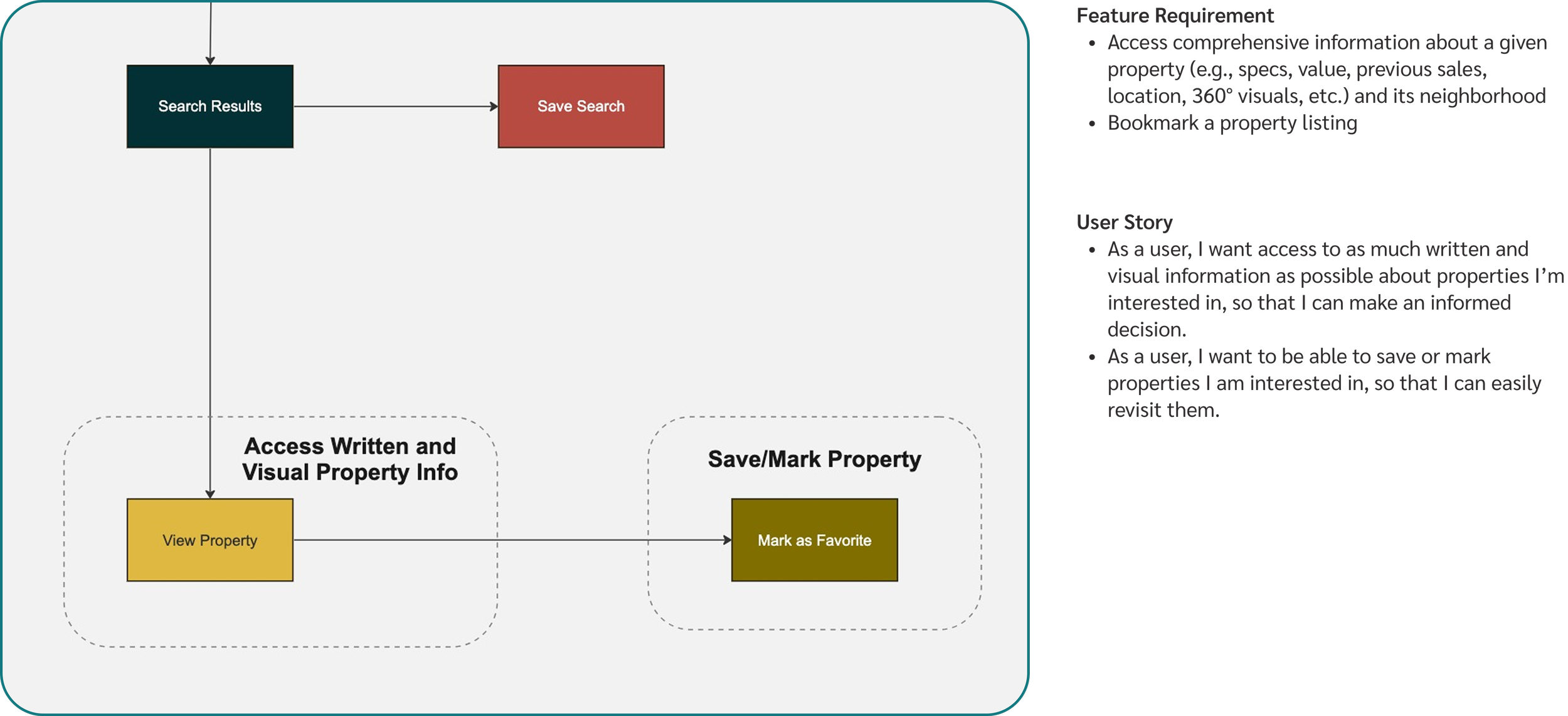
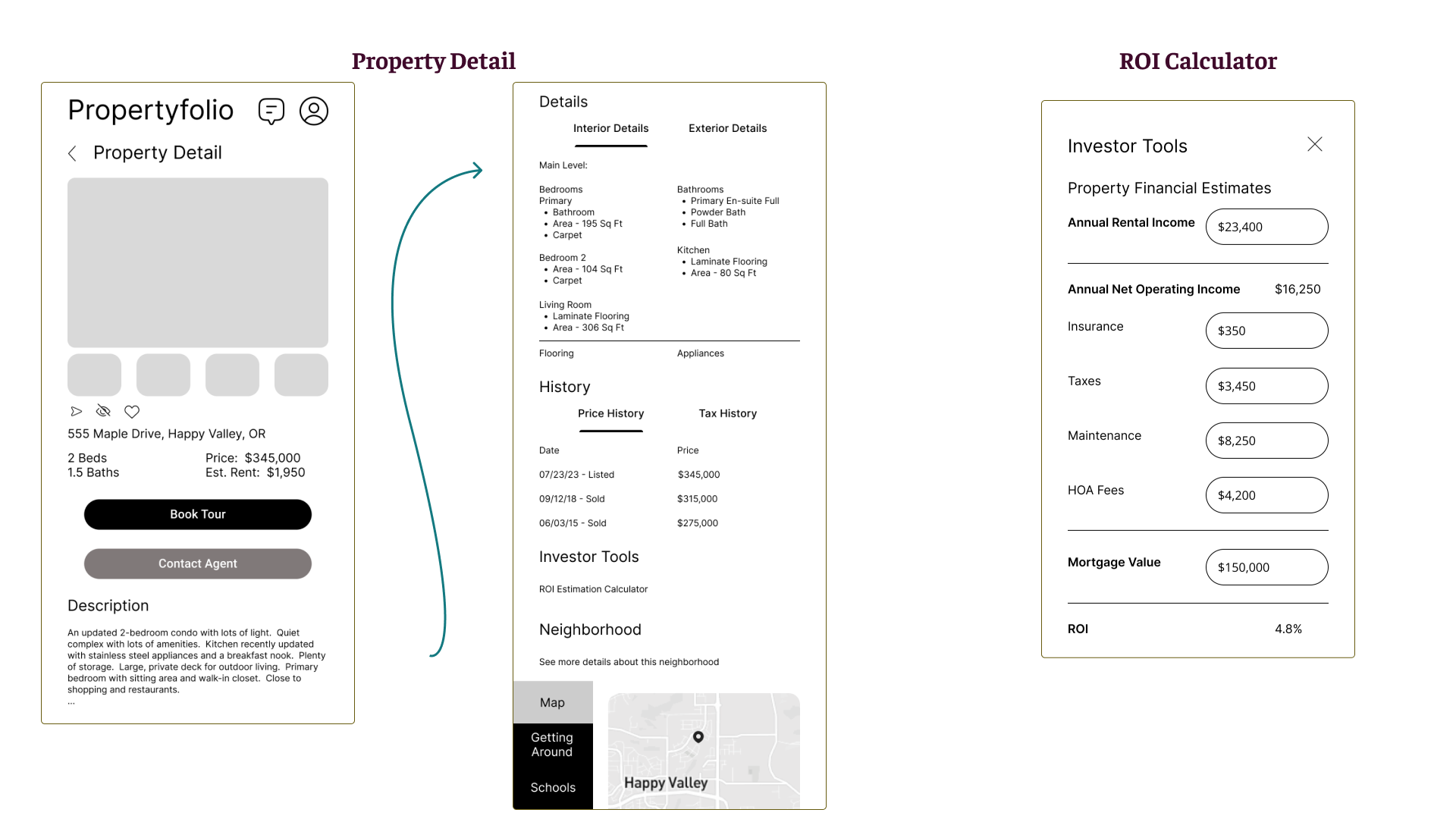
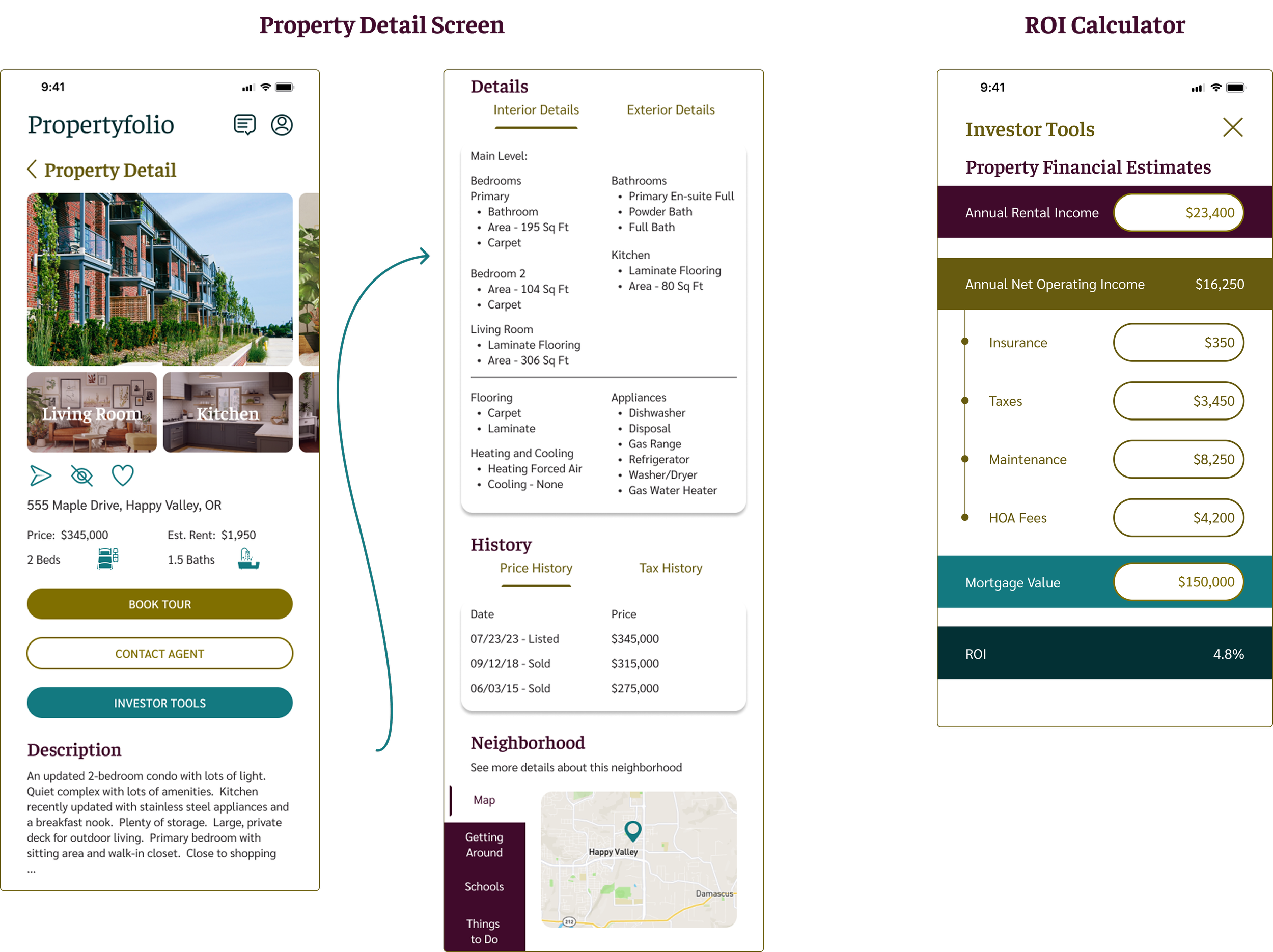
Access comprehensive information about a given property and its neighborhood
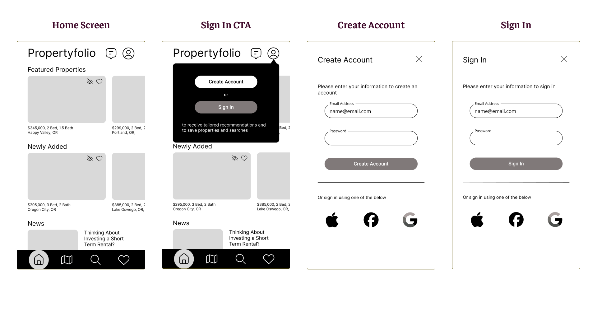
Bookmark a property listing
Property recommendations feature
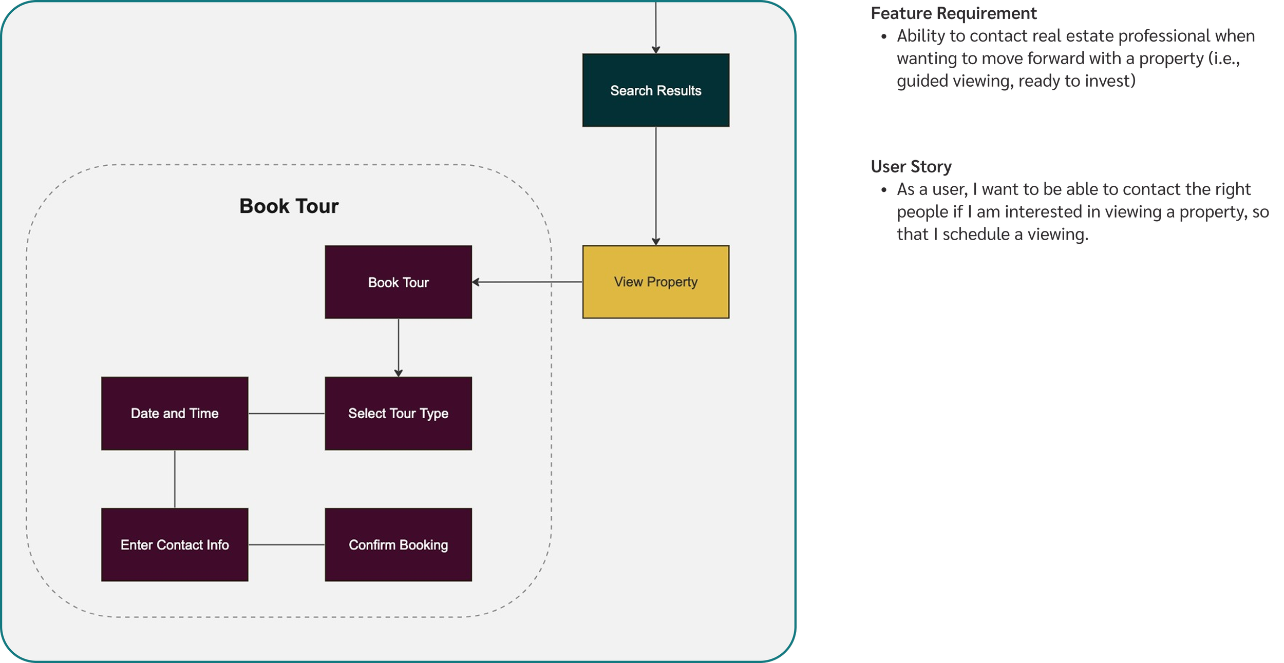
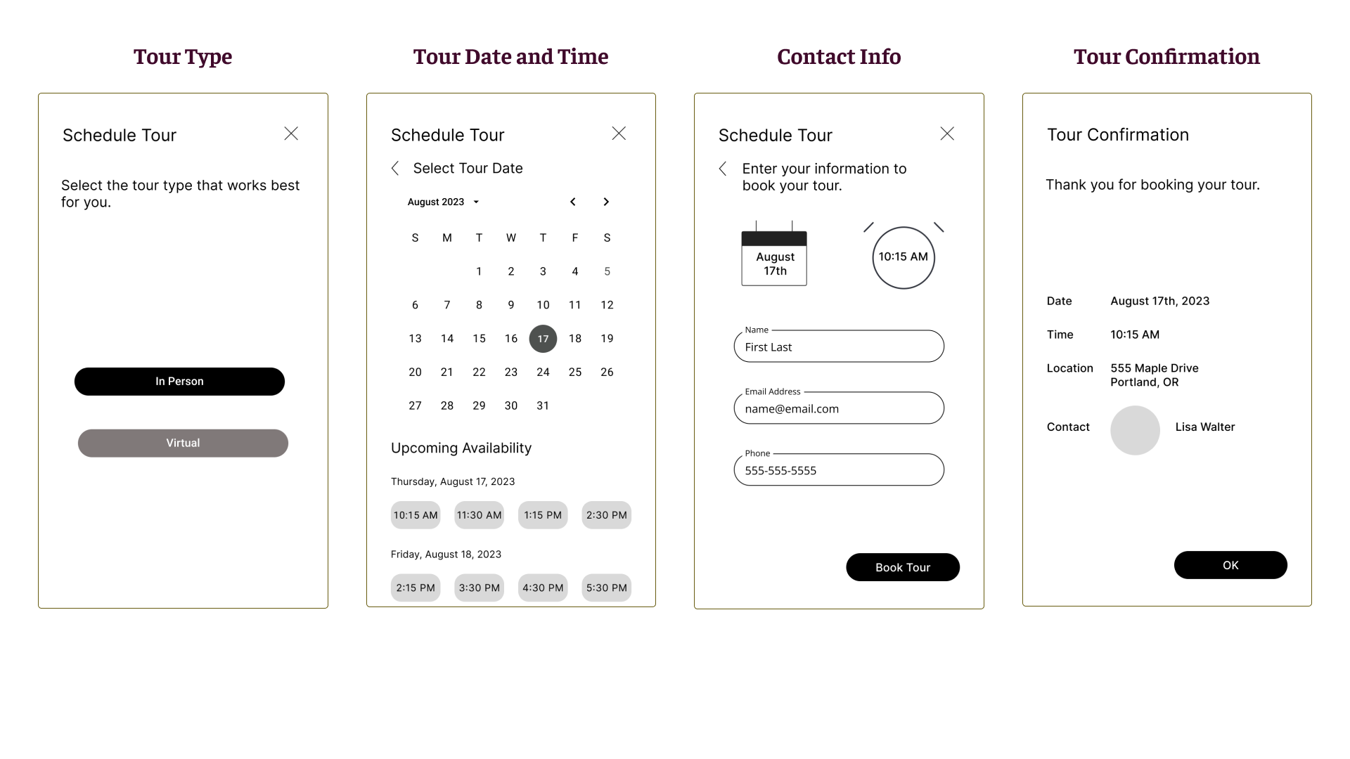
Ability to contact a real estate professional when wanting to move forward with a property
Per the project brief, this solution should be “made primarily for new, small-scale property buyers who are looking to invest for additional income or financial security.”
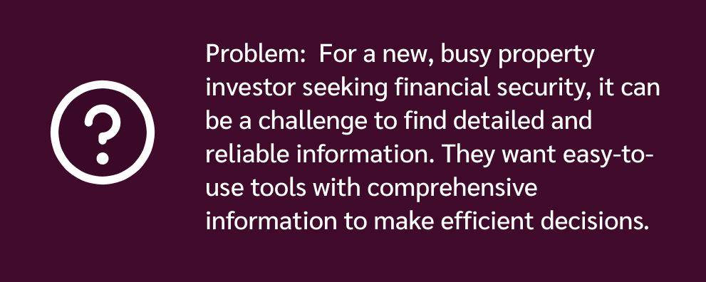
Problem
“Unseasoned buyers need access to reliable, uncomplicated information about their potential property to invest.”
My Role
I individually created the user flows, sketches, and prototypes, conducted usability and preference tests, and designed the UI elements of the application.
Deliverables
User Flows
Sketches
Prototype
Style Guide
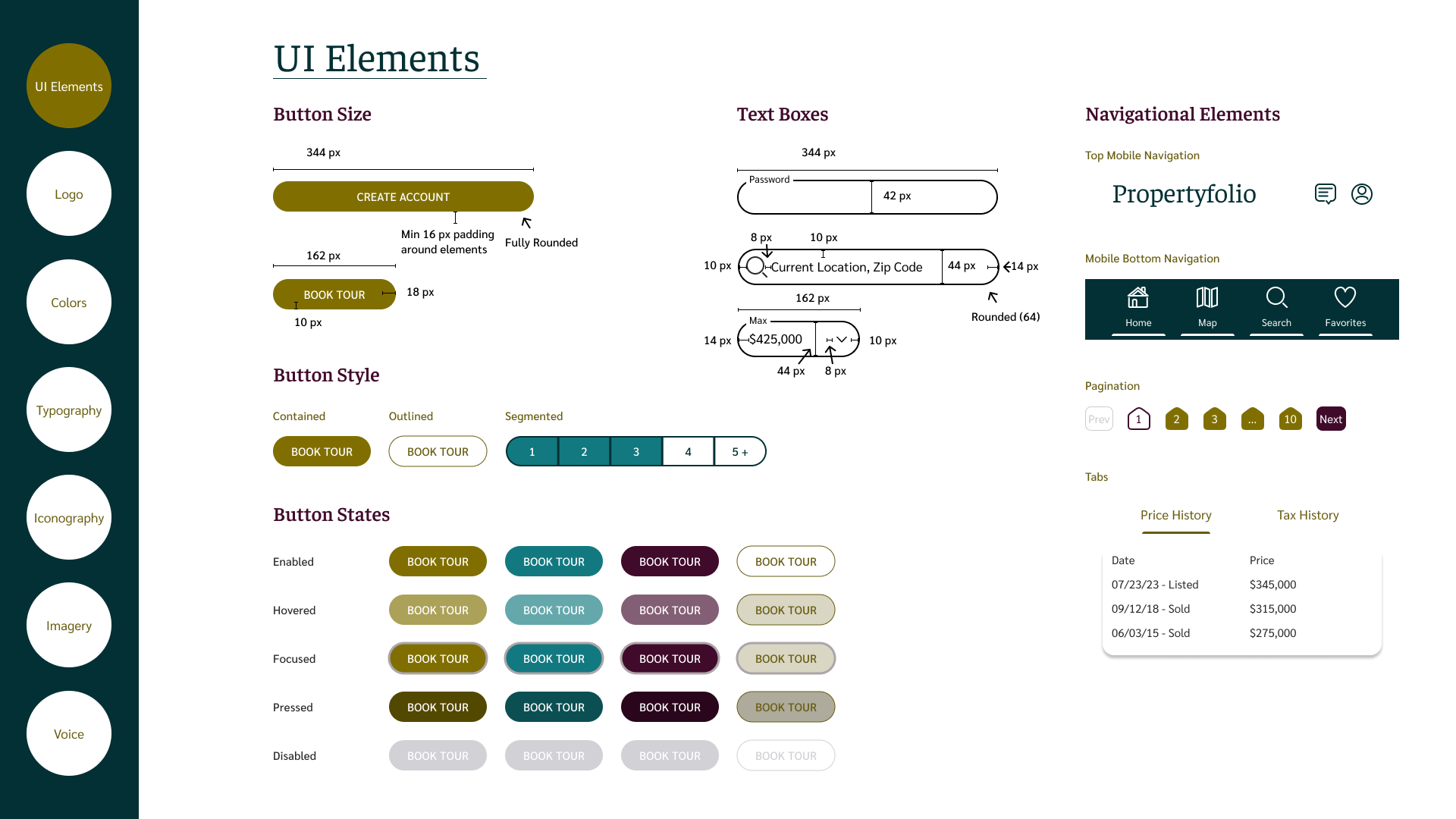
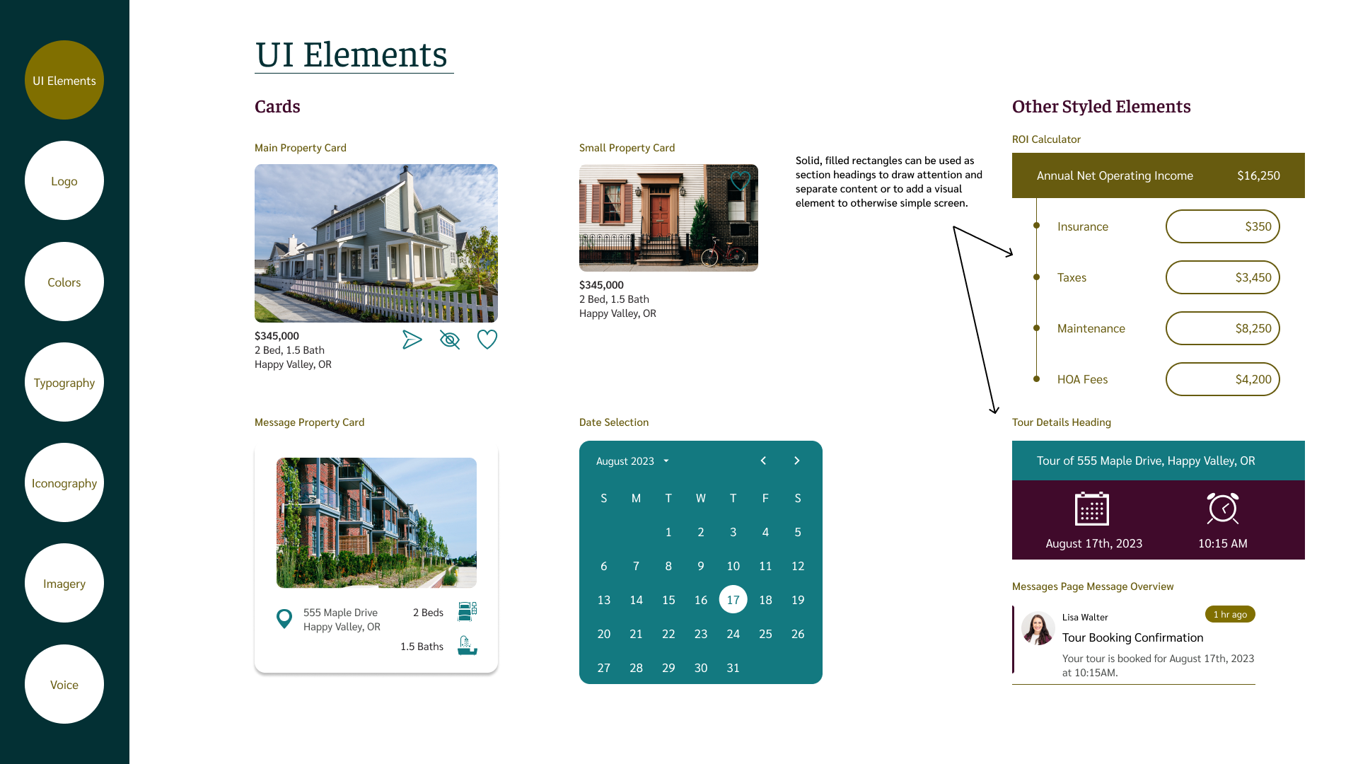
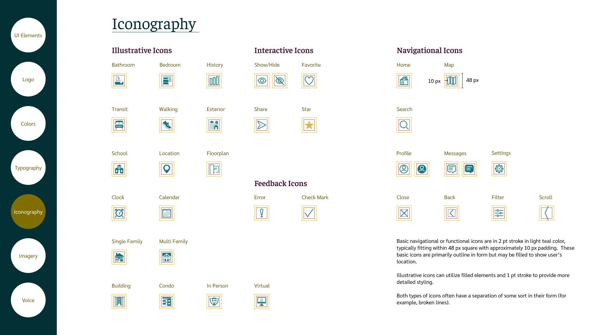
UI Elements (including Iconography)
Tools
Miro
Figma
Lyssna for Usability and Preference Tests
Paper and Pen
Property Investors Need Reliable, Comprehensive and Understandable Info
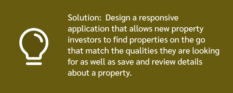
How Might We Provide This Information to Property Investors?
Who We Are Designing For

Identifying Possible User Stories


Reviewing the Competition
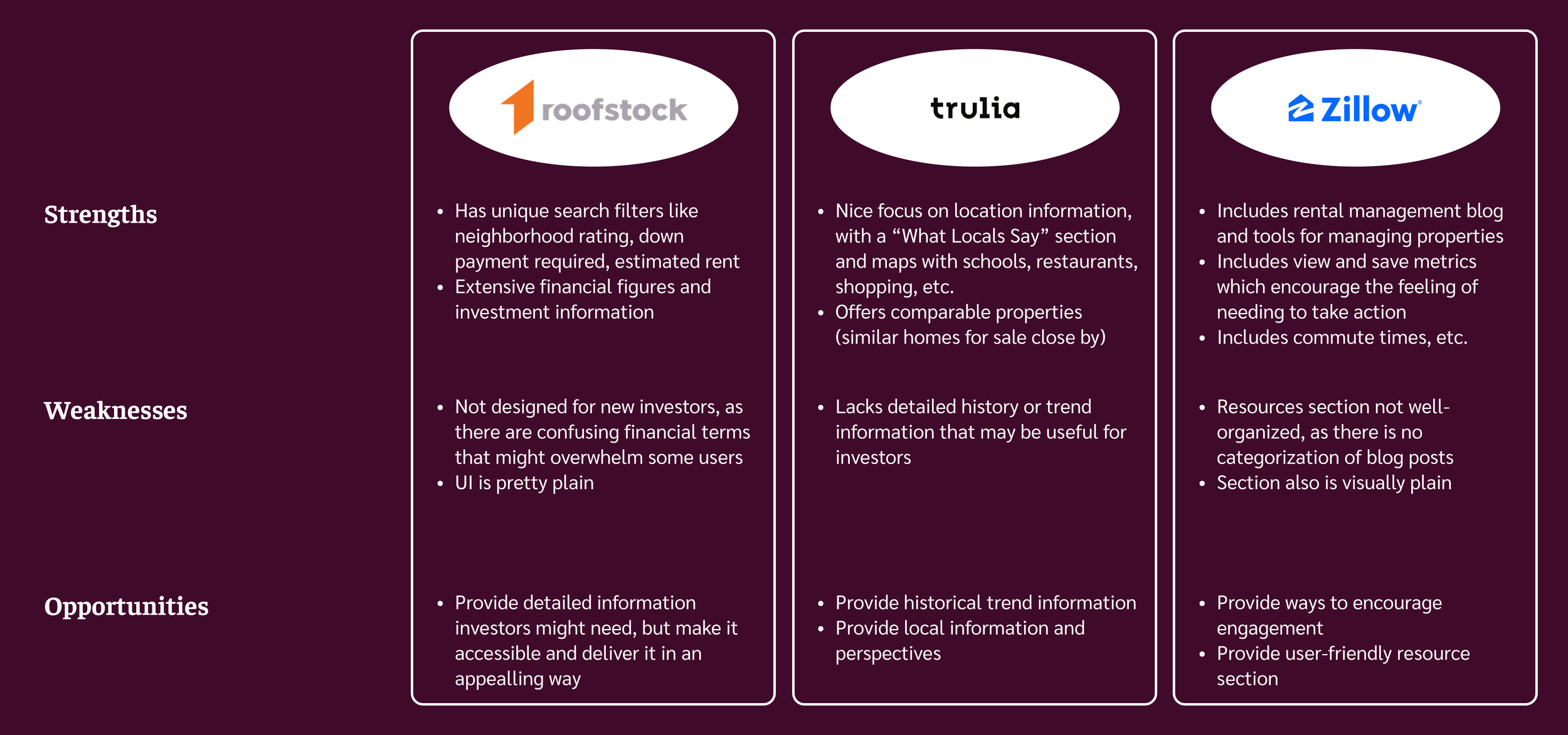
Takeaways
Our service can differentiate itself by providing property investors with information that is easy to understand AND presented in an engaging, visually appealing way
There are key common features among competitors that we should consider providing
Must Haves
Neighborhood information
Key search filter options, including those that would be particularly relevant to property investors
Tool to help users estimate key financial information
User Flows

Sketching
Mobile Sketches
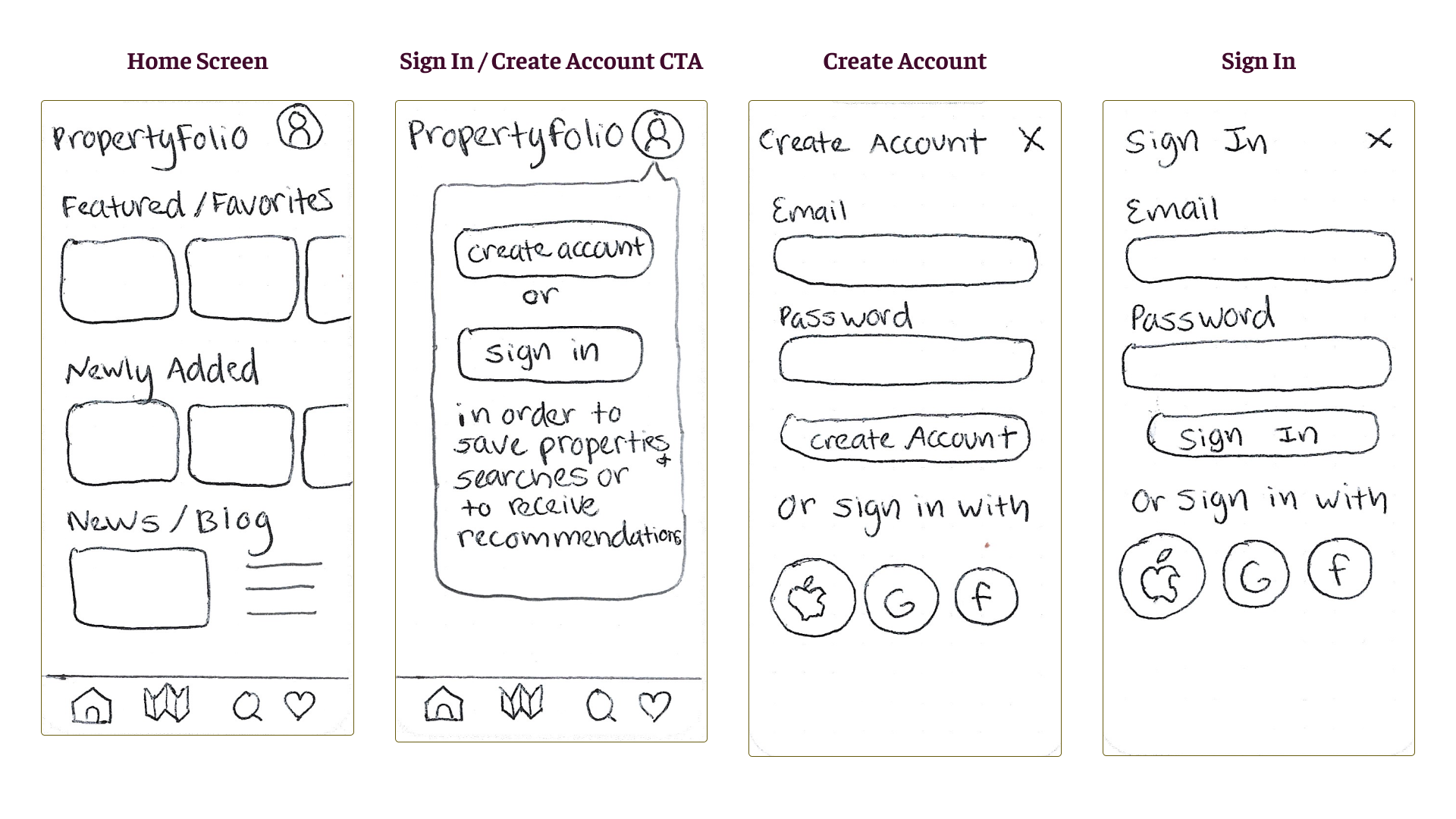


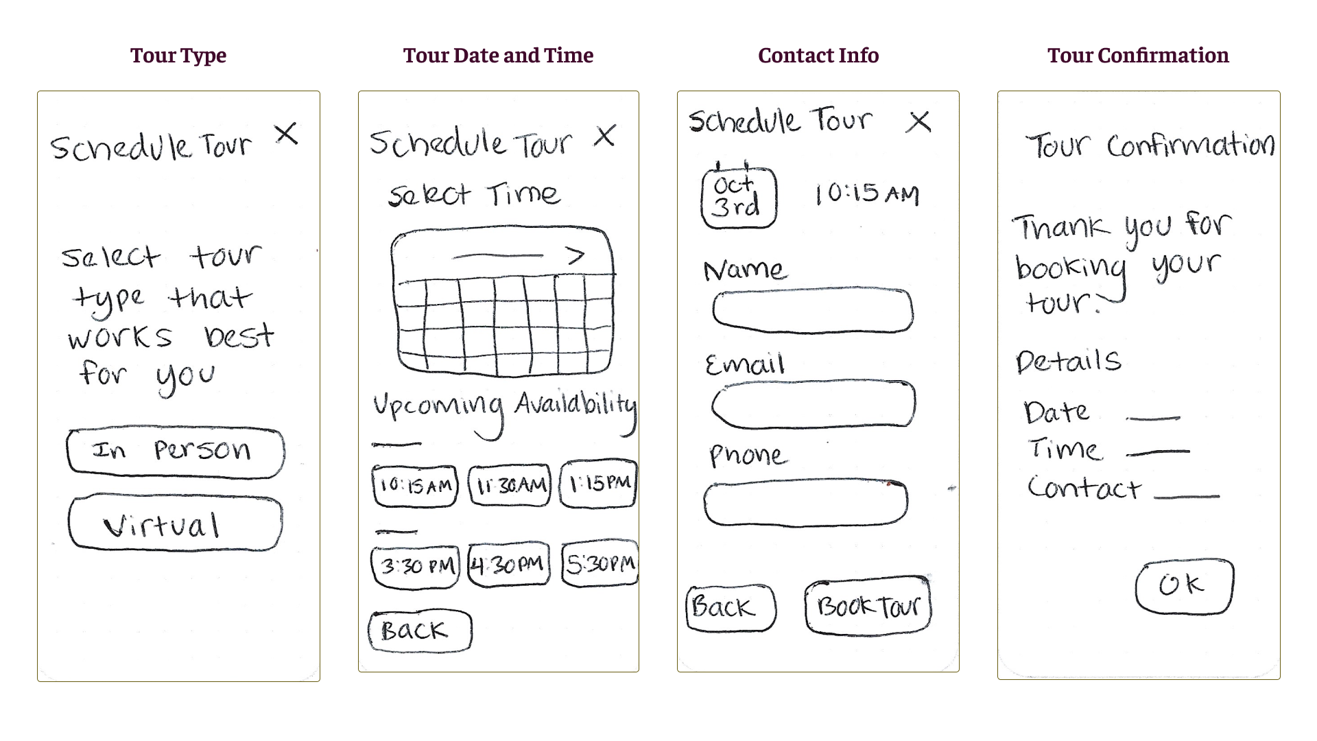
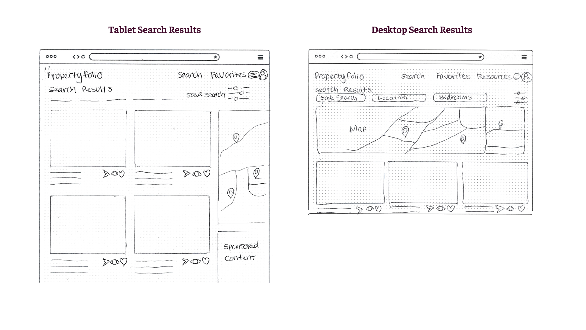
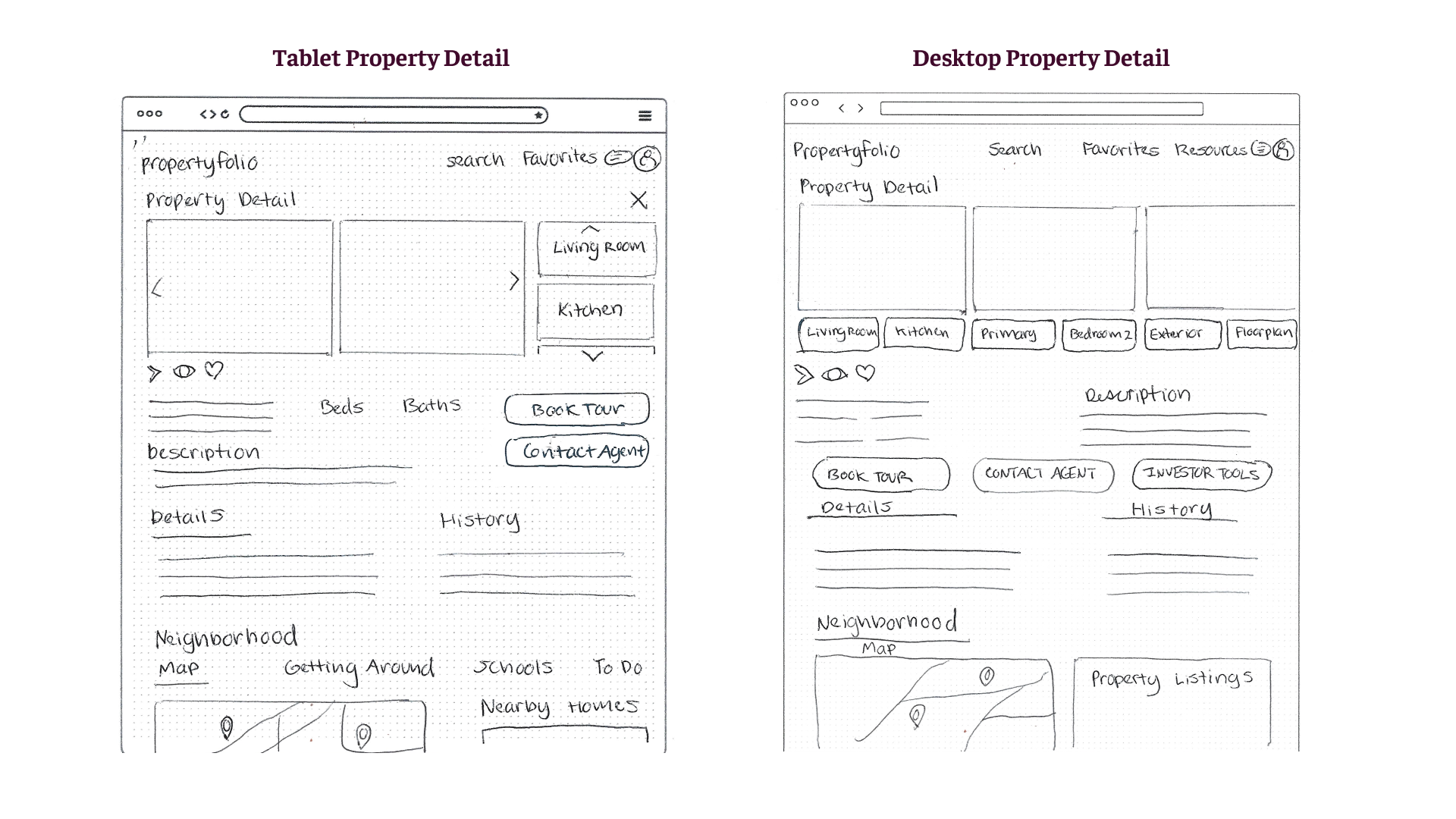
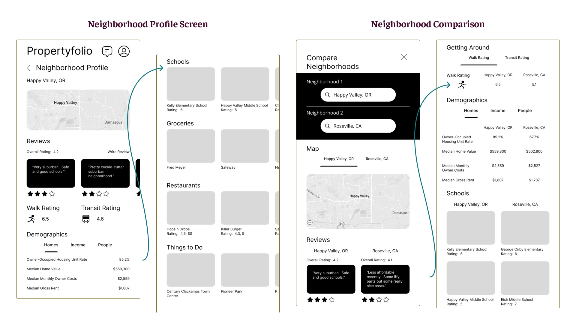
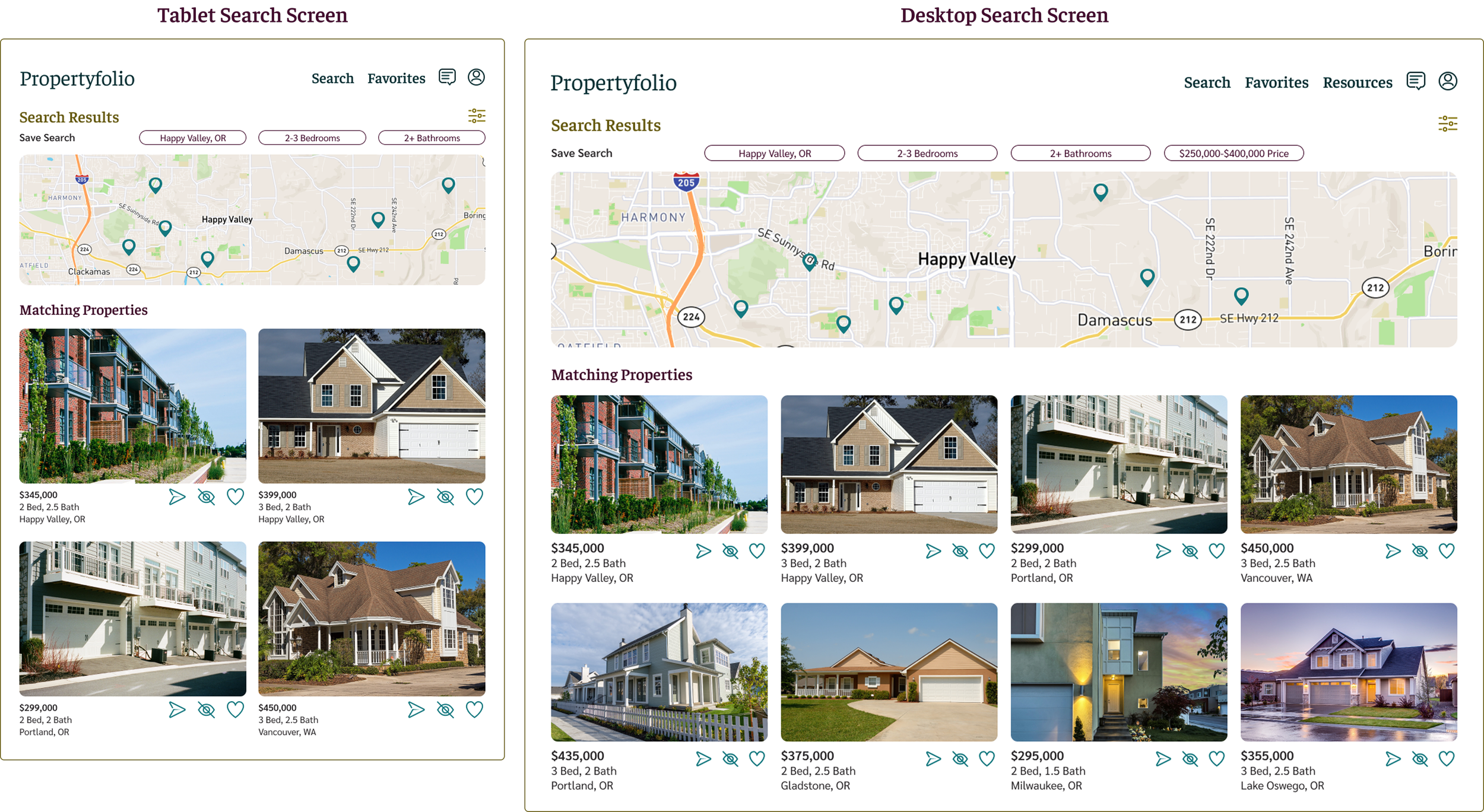
Tablet and Desktop Sketches

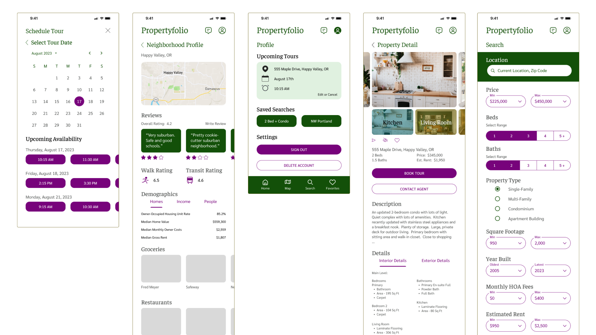
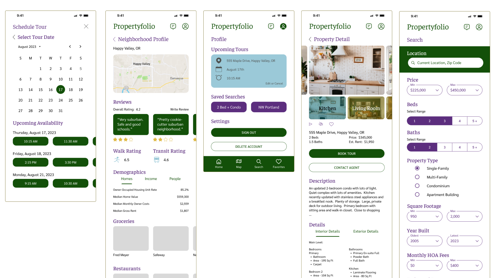
Mid-Fidelity Mobile Prototype
Testing for Usability
Testing Objectives
Can users navigate to key functionality in the application?
Search filter options
Favorite properties
Message an agent
View nearby properties
Calculate a property’s potential ROI
Are the design patterns in the prototype intuitive and clear?
Filter controls
Tab navigation
What are the initial impressions of the prototype?
Testing Takeaways
Tested with six participants via Lyssna
Users were generally able to complete tasks successfully with an acceptable level of satisfaction (means above 3.5 out of 1 = Very Difficult to 5 = Very Easy scale)
Only one task had a success rate below 100% (mark the property to find later - “favorite”), but this likely was a result of task wording and the selection of success criteria for testing
In addition, one participant pointed to needing larger touch targets for favoriting a property within the prototype, so I reviewed touch targets for all screens in the prototype
Key Quote: “Everything seemed very intuitive and organized logically.”

Creating the Mood
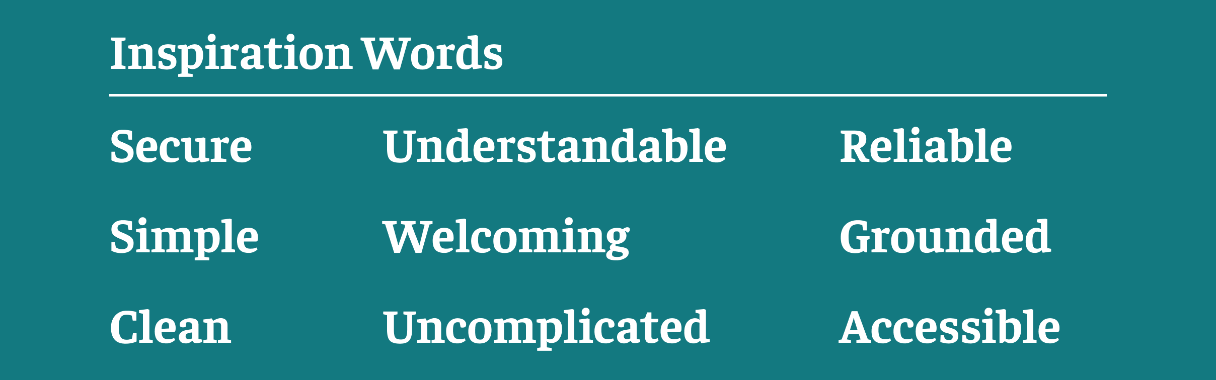
The design brief called for using purples, greens, and blues.
In addition, inspiration words from the design brief used to create initial mood boards were the following:
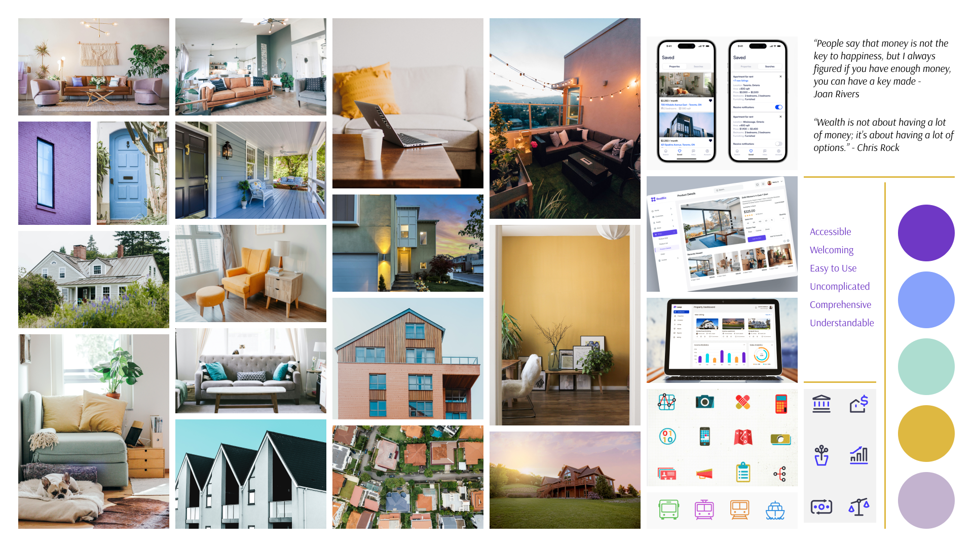
I developed two initial mood board options:
1) Mood Board 1 - rich jewel tones, minimalistic and serious, with organic elements like wood and plants complementing the jewel tones
2) Mood Board 2 - brighter colors, warmer and lighter in tone
As I considered the project’s goal of providing a solution for property investors to find potential investment properties, the simpler, more grounded direction of Mood Board 1 seemed more appropriate.

Mood Board 1
Mood Board 2
What's Your Preference?
With the direction of Mood Board 1 in mind, I drafted three variations of colors and color applications. Then I conducted a preference test via Lyssna with ten participants.
Based on the feedback, I reconsidered the colors with the following goals:
Using a brighter purple might not appeal to some users, and might not be the best fit for a persona seeking investment properties
I needed options to guide the user’s attention, with additional colors having a certain level of brightness that can stand out against a darker purple or blue

Color Scheme 1
Color Scheme 2

Color Scheme 3
Adding Some Color

With the preference test feedback, I updated the palette of purples, greens and blues. I sought a grounded palette that can be used in a variety of ways and is appropriate for an application meant for property investors.
The blues used are a light and dark teal, meant to inspire trust, security and professionalism. Blue is a popular color, but the teal differentiates Propertyfolio from many other apps.
Green demonstrates money and growth, as well as a desired sense of groundedness. The olive variations in our palette complement the earthy greens and browns in real estate photos. The lighter variation can be used to draw attention or provide contrast with the purples and blues.
The dark purple variation in our palette is meant to be more universally appealing compared to other purple variations that might skew “feminine” or “juvenile” for some users.
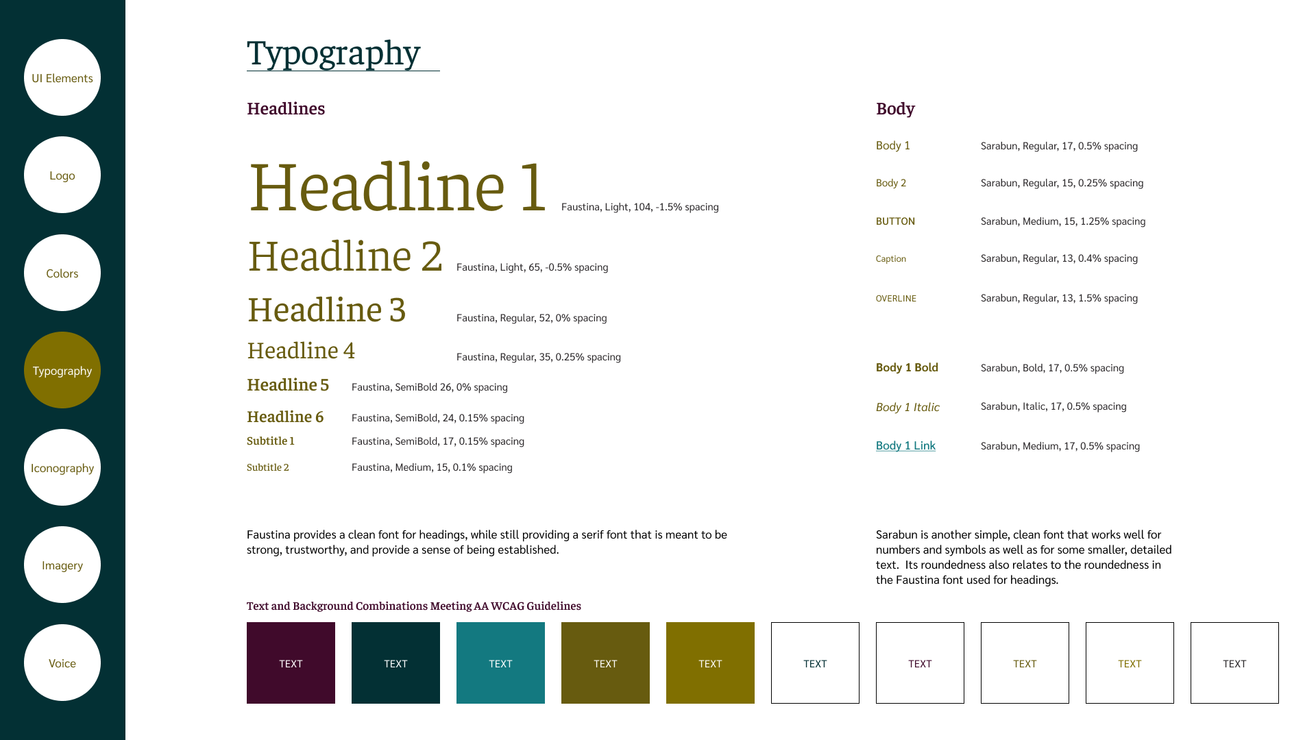
The Right Type
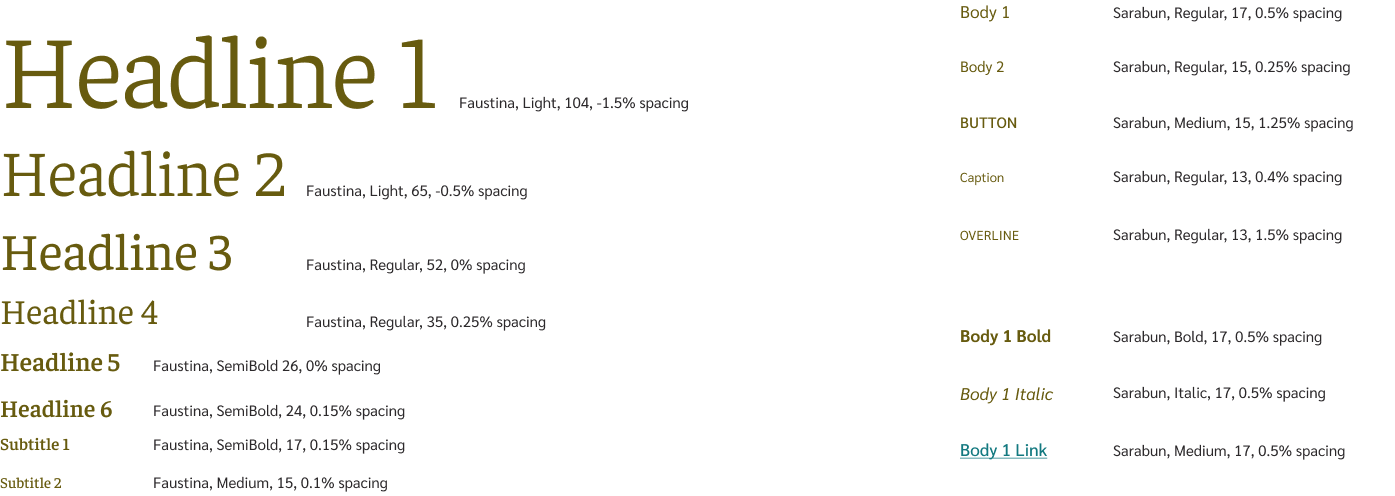
Faustina provides a clean font for headings, meant to be strong, trustworthy, and provide a sense of being established.
Sarabun is another simple, clean font that works well for numbers and symbols as well as for smaller, detailed text. Its roundedness also relates to the roundedness in the Faustina font used for headings.
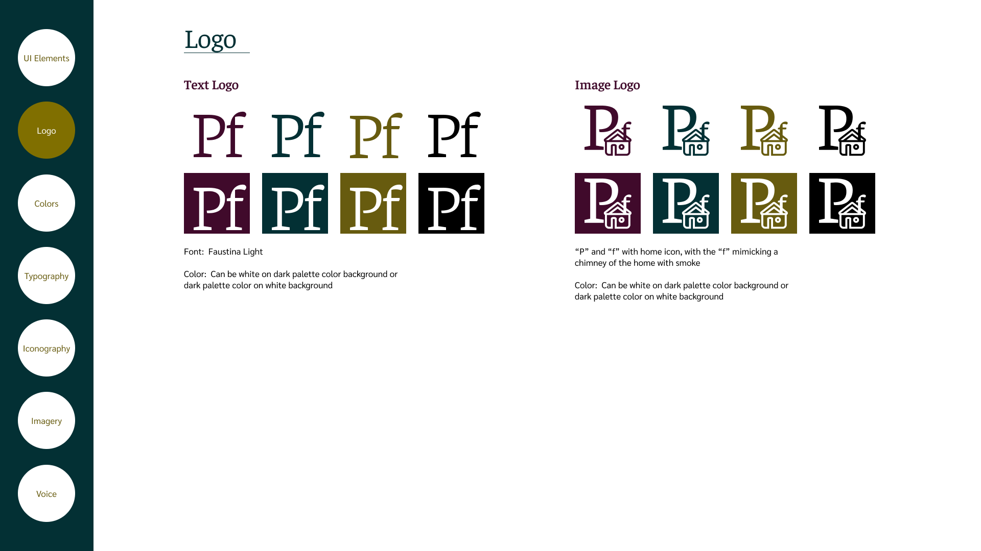
Style Guide


Working in High Fidelity for Mobile

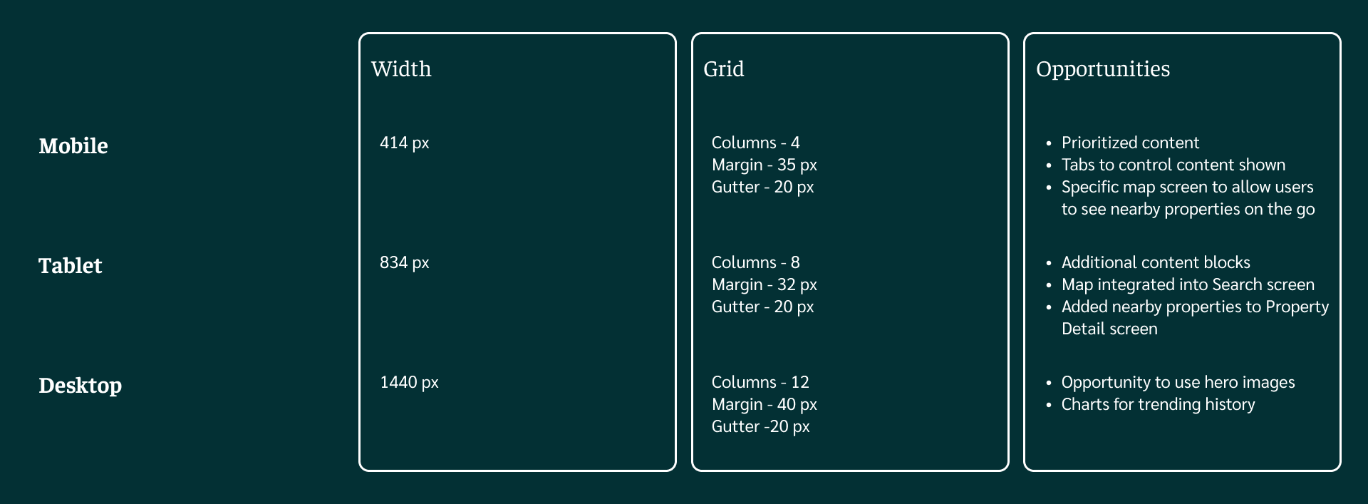
Designing for Other Platforms
With a persona that is often on the go, designing for multiple breakpoints is key and opens up additional design opportunities.


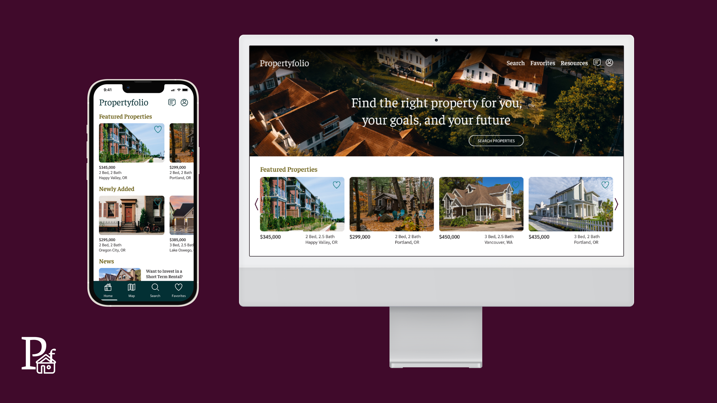

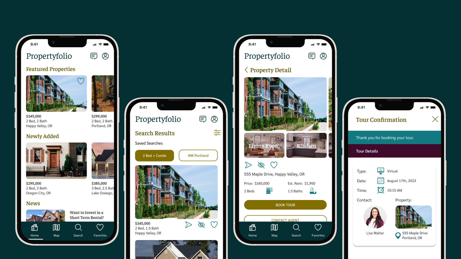
The Prototype
Learnings
Weigh feedback thoughtfully as you decide whether and how to apply it
The color palette should be appropriate for your personas and the purpose of your product
Mobile-first design allows you to establish priorities based on a small screen size
Designing for larger breakpoints opens additional opportunities to add content and make different design choices
There are tools you can use to inspire color choices, layouts, and transitions between breakpoints